UI Redesign for a Web Application Dashboard
Winner
Want to win a job like this?
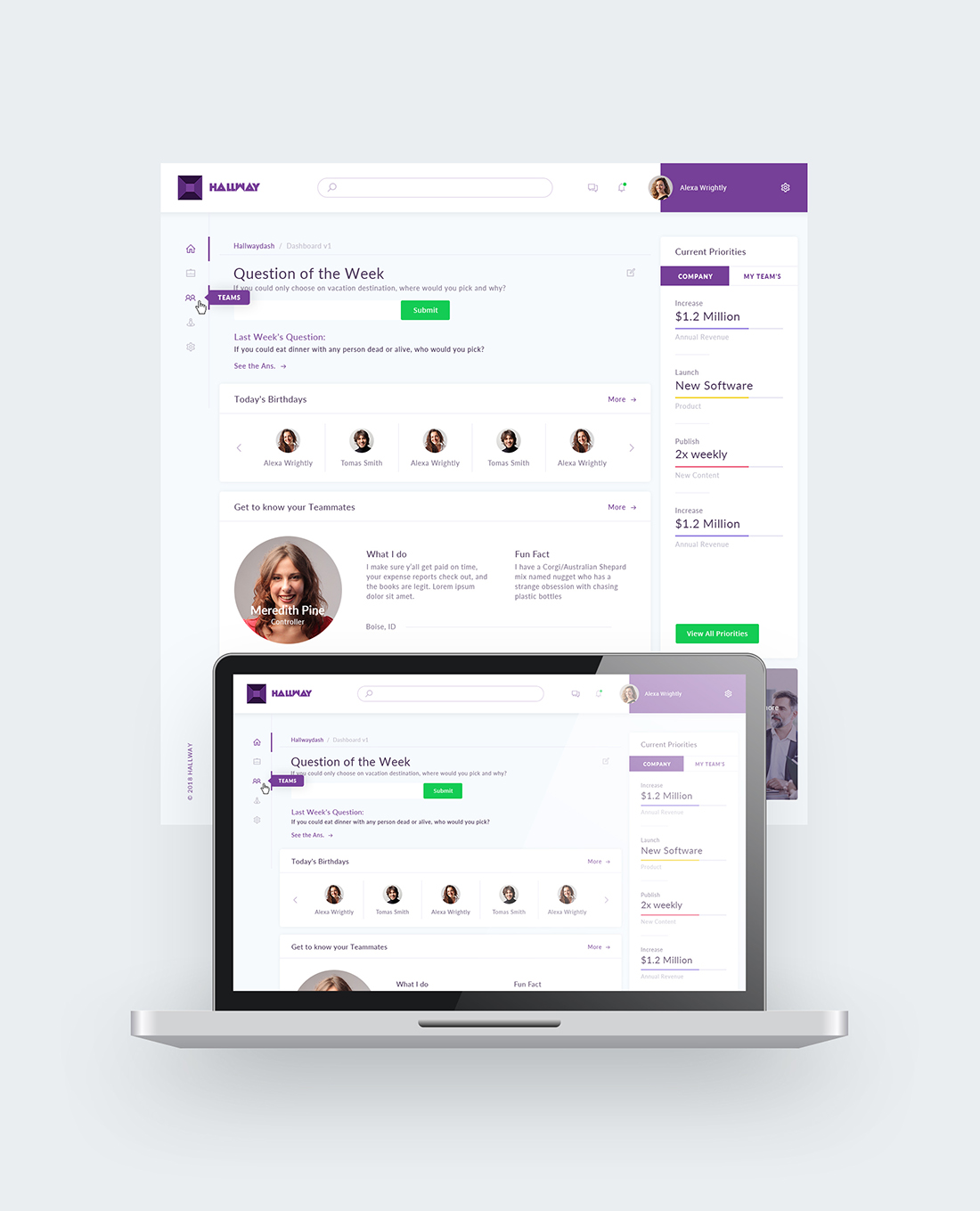
This customer received 30 web designs from 7 designers. They chose this web design from Ved Web Services as the winning design.
Join for free Find Design Jobs- Guaranteed
-
 US$140
-
 30 designs
-
 7 designers
Web Design Brief
I have an application with a dashboard that is pretty basic at the moment and doesn't have a lot of style. It's for a team-based collaboration tool that helps companies better communicate higher-level strategy. I'd love to have a designer come up with some ideas on how spruce it up so it doesn't look so generic bootstrap-y. There are additional images/app access available at https://brainstormingapp.bubbleapps.io.
Target Market(s)
B2B, small businesses, companies with distributed employees.
Industry/Entity Type
Software
Number of Pages Required
1 page
Font styles to use
Sans Serif
Look and feel
Each slider illustrates characteristics of the customer's brand and the style your logo design should communicate.
Elegant
Bold
Playful
Serious
Traditional
Modern
Personable
Professional
Feminine
Masculine
Colorful
Conservative
Economical
Upmarket
Requirements
Must have
- contain the following groups of elements as seen in the screenshot:
- - Question of the Week (question, input & submit, last week's question, see answers)
- - Company Priorities (list of three items)
- - Team priorities (list of three items)
- - Team member spotlight (profile image, name, location, team, interests, fun fact)
- - Help a team member out (list of three questions)
- - Birthdays (# may vary)
- - CEO's corner (video, message)
- Feel free to add, move, or edit fields as necessary to fit in with the design.
Nice to have
- I took some inspiration from stripe's site (https://stripe.com/blog/stripe-home) because it looks so nice. Would love if it looked as sleek.
Should not have
- Anything too girly, hard to read fonts,
Files
Download all files - 1.0 MBPNG
Screenshot 2018-06-27 21.57.06 Friday, 29 June 2018 01:56:19
Friday, June 29, 2018
JPG
hallway_logo-100 Friday, 29 June 2018 02:12:20
Friday, June 29, 2018
RTF
sample_copy Friday, 29 June 2018 02:29:20
Friday, June 29, 2018
PDF
sample_copy Friday, 29 June 2018 02:31:05
Friday, June 29, 2018
Payments
1st place
US$140