online gadget and gift shop looking for logo rework
Want to win a job like this?
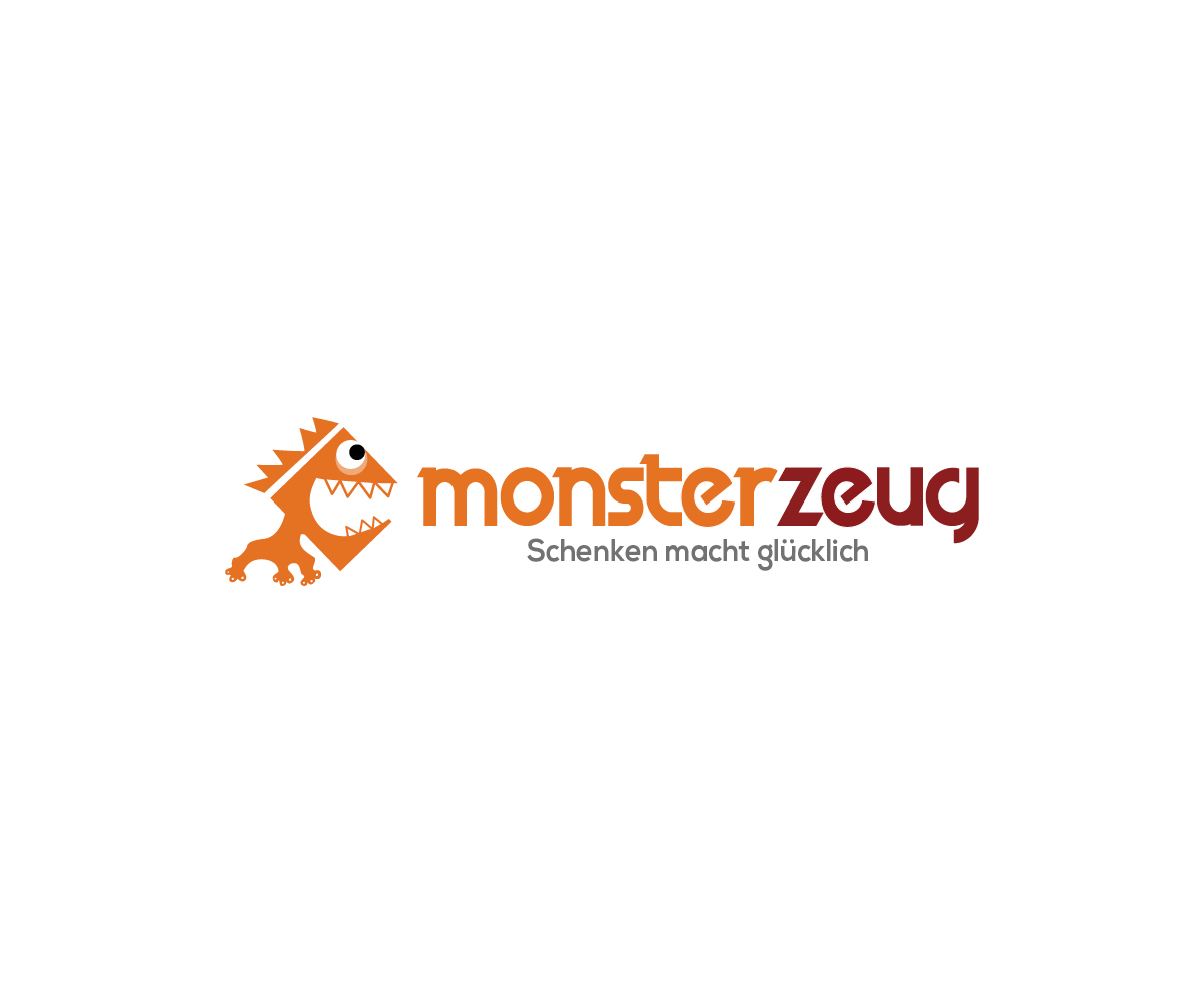
This customer received 40 logo designs from 27 designers. They chose this logo design from Bittersweet as the winning design.
Join for free Find Design Jobs- Guaranteed
-
 €190
€190
-
 40 designs
-
 27 designers
Logo Design Brief
MonsterZeug is a german online shop selling personalized gifts and gadgets Hi, we're currently looking at the update for our shop mascot, "Marty McMonster" and possibly a new logotype to go along with 'd like to have reflected in our brand mascot and logo, which has been in service since 2008). Your emphasis should be on reworking "Marty McMonster," making him more geometric, reducing the amount of small details (in a similar fashion to the other characters in "current_404.jpg"). The new look should be more appropriate / scaled for smaller viewports. Except for the orange skin color, other features of the current logo may vary (ie number of eyeballs, teeth, tentacles, arms, clothing). Feel free to present a cropped version, or focus on the face / head only, but please refrain from making him too kawaii / sd / cute (for reference see "rejected_inhouse.jpg")
Target Market(s)
MonsterZeug is a germany-based company running an online store for personalized gifts, original presents and gadgets, founded in 2008. Our customer base is mainly female (~ 70%), shopping gifts for friends, spouses or relatives.
Logo Text
MonsterZeug
Logo styles of interest
Pictorial/Combination Logo
A real-world object (optional text)
Character Logo
Logo with illustration or character
Font styles to use
Colors
Colors selected by the customer to be used in the logo design:
Look and feel
Each slider illustrates characteristics of the customer's brand and the style your logo design should communicate.
Elegant
Bold
Playful
Serious
Traditional
Modern
Personable
Professional
Feminine
Masculine
Colorful
Conservative
Economical
Upmarket
Requirements
Must have
- Keep it simple. The new look should be more appropriate / scaled for smaller viewports. The overall color scheme and balance should remain intact, the provided orange tone (see "colors.pdf" for reference) has become the main color of the mascot. Your design should be flat, unshaded and should not rely on thin outlines.
Nice to have
- Feel free to present a cropped version, or focus on the face / head only, but please refrain from making him too kawaii / sd / cute (for reference see "rejected_inhouse.jpg")
Should not have
- Please do not shade your design too much, do not look for anything involving gradients, thin outlines or heavy shading - your design should be flat and color-blocked. Since then, we have been looking at some of our most important non-gender specific looks.