Logo design for soSIMPLE Software branding
Want to win a job like this?
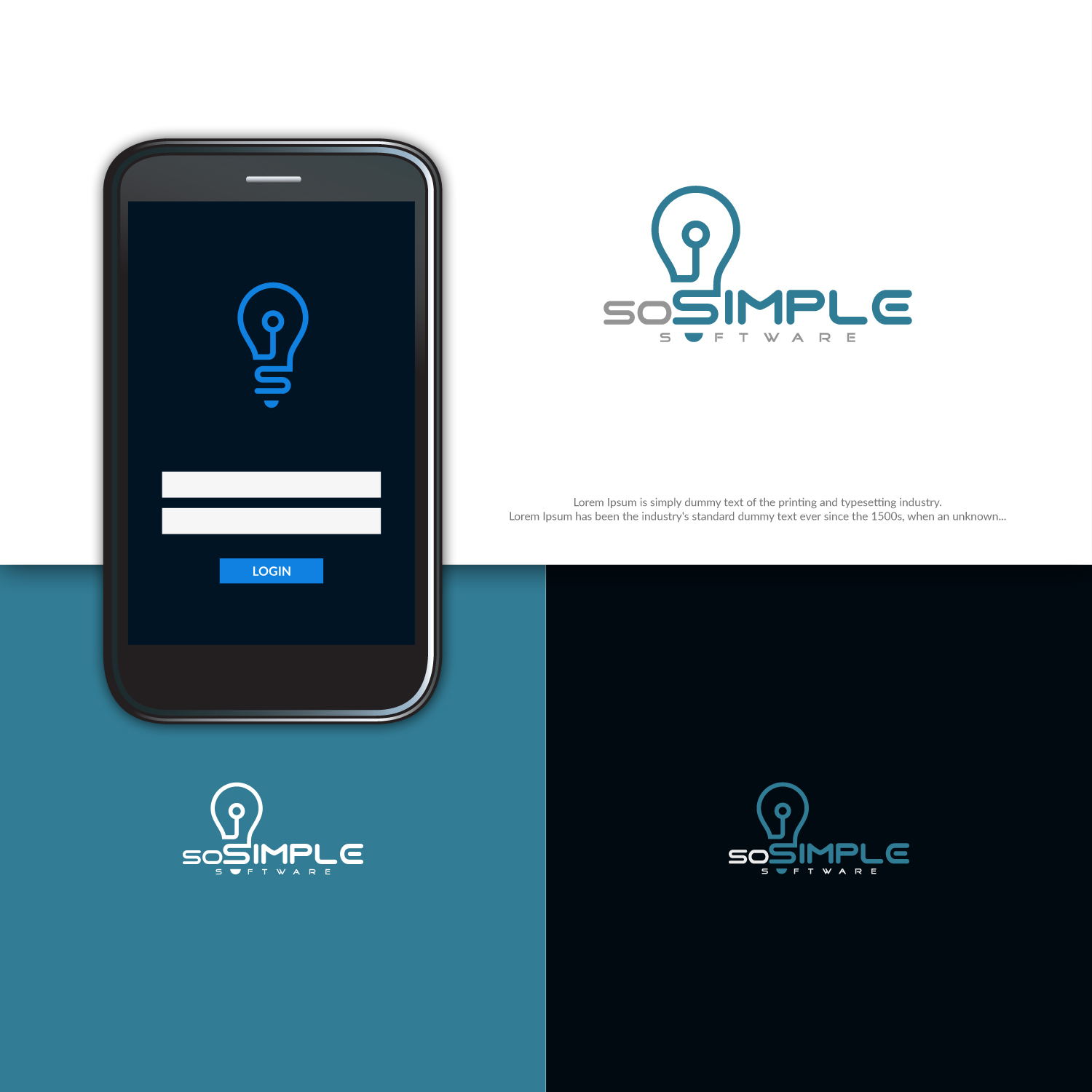
This customer received 124 logo designs from 70 designers. They chose this logo design from ideaz2050 as the winning design.
Join for free Find Design Jobs-
 US$150
-
 124 designs
-
 70 designers
Logo Design Brief
Designing new logo for a brand we've been using for years. We've previously just used lettering, or in combination with our company logo.
Some of the values we're looking to portray: Clean, simple, quality software. modern, forward-thinking, innovators.
We've been playing around with the lightbulb idea. But some of the reaction has been that while it captures the "simple" part, it doesn't capture the "modern" part. I think if we could stylize or modernize the light bulb it might work better.
Not necessary, but if we gracefully include elements of our company logo, that would be nice. That's why we chose teal as the color.
Updates
Need extra days to review
Target Market(s)
FileMaker Pro developers and power-users.
Industry/Entity Type
Business Software
Logo Text
soSIMPLE Software
Logo styles of interest
Pictorial/Combination Logo
A real-world object (optional text)
Look and feel
Each slider illustrates characteristics of the customer's brand and the style your logo design should communicate.
Elegant
Bold
Playful
Serious
Traditional
Modern
Personable
Professional
Feminine
Masculine
Colorful
Conservative
Economical
Upmarket
Requirements
Must have
- Color teal from company logo.
Nice to have
- Project description says most of it. I'm liking the lightbulb idea, but needs to be more modern. I also like that the lightbulb has the letter "S" in the stem. But it looks a little old-fashioned, and we need modern.