Environmental non-profit needs logo
Want to win a job like this?
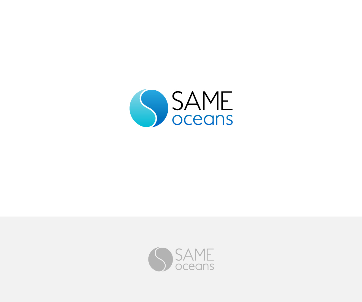
This customer received 137 logo designs from 58 designers. They chose this logo design from aglaronde23 as the winning design.
Join for free Find Design Jobs-
 €160
€160
-
 137 designs
-
 58 designers
Logo Design Brief
We need a logo for a non-profit company called 'SAME oceans'. We want to run projects in different countries to educate and raise awareness about the plastic pollution, and help save the oceans from plastic death. SAME stands for 'So All May Enjoy', so it would be great if this could be part of the logo (for example in small letter under SAME). I already thought about using the first two letters of our name (S and O) and merge them together, to a child of yin and yang sign. This could be styled as water, or - even better - waves. You can see the idea in the picture below. However, the S should be up straight, not in the picture where it leans to the left. The S should therefore be formed out of the same font as used for the word SAME, so it should be a font that melts into a circle and that creates the look of water / waves in the logo. The logo should be modern, clean and not too playful, so it can be easily reproduced on all sorts of material. I would prefer the colors of the ocean, a deep blue, maybe lighter blue or even a touch of turquoise would be possible. It would be great if I could use the logo so without the name, so a seperation of logo design and name design would be preferable.
Updates
Mehr Feedback sammeln
Logo Text
SAME oceans
Font styles to use
Colors
Colors selected by the customer to be used in the logo design:
Look and feel
Each slider illustrates characteristics of the customer's brand and the style your logo design should communicate.
Elegant
Bold
Playful
Serious
Traditional
Modern
Personable
Professional
Feminine
Masculine
Colorful
Conservative
Economical
Upmarket
Requirements
Must have
- Yin and yang sign (without the dots), styled as water or waves. The S from SAME should be used as the seperation between the tho halves, so the font should fit into the circle-logo perfectly, creating a look of water / waves. 'So All May Enjoy' (the acronym for SAME) should be added to the logo. SAME itself, or writing it around the circle if possible. Any other idea is so welcome.
Nice to have
- Clean, simple and modern.