DistributorVine.com "RE-SKIN" project
Want to win a job like this?
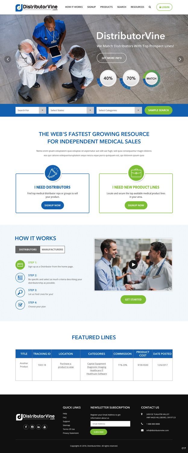
This customer received 26 web designs from 3 designers. They chose this web design from pb as the winning design.
Join for free Find Design Jobs- Guaranteed
-
 US$380
-
 26 designs
-
 3 designers
Web Design Brief
We have an existing site that we've recently built that needs to be re-formatted, skinned and polished. Our current developer did an amazing job building the backend but it not an expert in design and formatting of HTML and Web design. We need to have site cleaned up with all new formatting, layout, design elements and visual effects. ALl the date and functionality of the site will remain the same.
We would like to see Home page mock ups that may include Photo's, Flash, etc. or any other design element the designer feels would convey, a corporate, business oriented, simple and clean feel. The way the site currently looks is very basic and we need to have a slick, visual pleasing and easy to navigate design to go with our new functionality. The home page design will then need to translate over into the remaining pages of the site.
This is business to business site and will act as recruitment tool for medical device organizations. We have created a nationwide database of the top medical distributor groups (independent sale reps and groups). We act a "dating site" for medical manufacturers to find the best reps to sell their products.
NOTES on DESIGN:
* THE FUNCTION AND DATA OF THE SITE WILL REMAIN THE SAME, THIS PROJECT WILL BE TAKING ALL EXISTING INFO AND RE-DESIGNING THE LAYOUT.
*Must keep same color scheme
*Home Page design will be main focus and then ALL other pages need to follow style and template of Home page
* The sign up process on the site is in desperate need of re-design and we would like to see BIG, Step by Step, windows that make it feel very simple for the user to fill out (Best example we can think of is the Healthcare.gov site step by step sign up process. As bad as the overall functionality is on that site, the sign up process and drop down menu steps are easy to fill out.)
*The site is currently in a very basic "utilitarian" style and has very little in way of design, text formatting, and overall appearance. We need to have the designer go through each page and JUSTIFY, RE-SIZE, RE-SCALE and dress up all the current information displayed.
* We need the display pages to be easier to read, have better flow and more visually pleasing. (EXAMPLE: ANy search results that are done on the site come back in very table driven, hard to read, small text with small logo. We would like to see more design elements with updated formats and hopefully larger icons and east to read and navigate text
* WE ARE OPEN TO ANY DESIGN IDEAS OR MOCK UPS.
* Logos, icons, animation etc need to remain the same.
*Home page can feature video or photos but the remainder of the site will remian data only.
Updates
We would suggest doing a Mock up of the HOME PAGE only to begin with. We can then evaluate and choose a design theme/concept to carry over into the remainder of the pages.
Added Tuesday, May 22, 2018
Target Market(s)
Independent Medical Sales Distributors (sales reps) and Medical device manufacturers.
Industry/Entity Type
Recruitment
Coding
Coded - Design and coding required
Number of Pages Required
5+ page
Font styles to use
Colors
Colors selected by the customer to be used in the logo design:
Look and feel
Each slider illustrates characteristics of the customer's brand and the style your logo design should communicate.
Elegant
Bold
Playful
Serious
Traditional
Modern
Personable
Professional
Feminine
Masculine
Colorful
Conservative
Economical
Upmarket
Requirements
Must have
- *Must be Mobile Friendly
- *Must use all the info, links, logos and icons currently on www.DistributorVine.com
- *All pages of the site must follow to layout and design of the Home Page that is created in this project
- *Every page needs to be updated
Nice to have
- Glossy, crisp home page, that incorporate "stock" photos or animation for a more promotional or brochure type of feel
- Easy to navigate, bigger text and buttons and icons.
Should not have
- Color scheme and logo should not change