enduro coatings that out perform logo
Want to win a job like this?
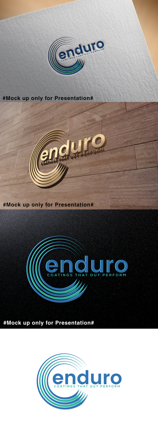
This customer received 31 logo designs from 22 designers. They chose this logo design from designmind78 as the winning design.
Join for free Find Design Jobs-
 A$120
A$120
-
 31 designs
-
 22 designers
Logo Design Brief
logo for start up company who produce specialty coatings and (later) paints of superior performance
Owner is design conscious, fastidious, keeps everything immaculate - so image must fit his style. Contemporary elegant while still bold. Fluid not static.
Must work with outdoor signage including vehicles.
Colour preference is wide but pivots around blue/teal. Will accept warm accents and even full rainbow if design warrants it and it works. Needs to be bold enough for emblem to be recongisable on product label on hardware store shelves and online and in outdoor signage.
Target Market(s)
trade
Logo Text
enduro /coatings that out perform
Logo styles of interest
Pictorial/Combination Logo
A real-world object (optional text)
Abstract Logo
Conceptual / symbolic (optional text)
Wordmark Logo
Word or name based logo (text only)
Font styles to use
Colors
Colors selected by the customer to be used in the logo design:
Look and feel
Each slider illustrates characteristics of the customer's brand and the style your logo design should communicate.
Elegant
Bold
Playful
Serious
Traditional
Modern
Personable
Professional
Feminine
Masculine
Colorful
Conservative
Economical
Upmarket
Requirements
Must have
- Must have: name and slogan - can feature "enduro" without "coatings" although formal name is Enduro Coatings P/L
- Slogan: "coatings that out perform".
- Must work well rendered in colour and grey scale
- must be fluid elegant sophisticated
Nice to have
- either a lazy curve modeled after the Windows "Mystify" screen saver, like the Nike tick, but rotated clockwise/sideways surrounding the name "enduro" coming out of the open side, and the slogan "coatings that out perform" underneath.
- or alternatively
- something 3D-ish that looks like a viscous coating pouring from a can (without the can) - The owner suggested filled drops/drips that have rounded surface/look molded, on a path that follows a Capital C and maybe the puddle of coating as if poured from the bottom/tail of the C...
- Overall: Font/impression Clean simple elegant please, but sufficiently bold to do well in outdoor signage.
- COLOUR: electric blue through teal, to represent "aqua" (one of their products is an aqua coating)
Should not have
- heavy, clunky, square.