Black Knight Erotica
Want to win a job like this?
This customer received 17 web designs from 5 designers. They chose this web design from Lauren as the winning design.
Join for free Find Design Jobs- Guaranteed
-
 A$395
A$395
-
 17 designs
-
 5 designers
Web Design Brief
The site is an Adult Retail Store website that sells products. There will be a Splash Page and inside (Home Page). The Splash page will have normal warning to users that 18+ material is inside. The splash page will contain....
- Lady (logo)
- disclaimer link for under 18
- enter and exit buttons
- Other detail in the must have
The client has also asked that this Splash Page must set the tone for the whole site and encourage users to enter. The client would like to give a feeling of romance, beauty, elegance, classy, inviting. The client would like to move away from the stigma associated with Adult stores as “sleezy” and create a welcoming feel for both males and females.
Also an internal Home Page will be created for the website which will take the same look and feel as the Splash Page. There will be a graphic header using some of the images below. Once the Home Page has been designer there will be minor colour background changes to the internal Home Page for the 2 Shop Pages (See Below).
Black Knight is the largest adult store in Adelaide and will be using this website primarily to sell their products online.
Target Market(s)
Described as a “his and hers adult store” Black Knight focuses on both males and females over the age of 18.
Look and feel
Each slider illustrates characteristics of the customer's brand and the style your logo design should communicate.
Elegant
Bold
Playful
Serious
Traditional
Modern
Personable
Professional
Feminine
Masculine
Colorful
Conservative
Economical
Upmarket
Requirements
Must have
- Black Knights three main colours are Black, Purple and White. Please refer to current site for exact values.
- Also various gradients of these colours are encouraged to bring the website up to date with modern trends. The current website www.blackknighterotica.com.au is very outdated!
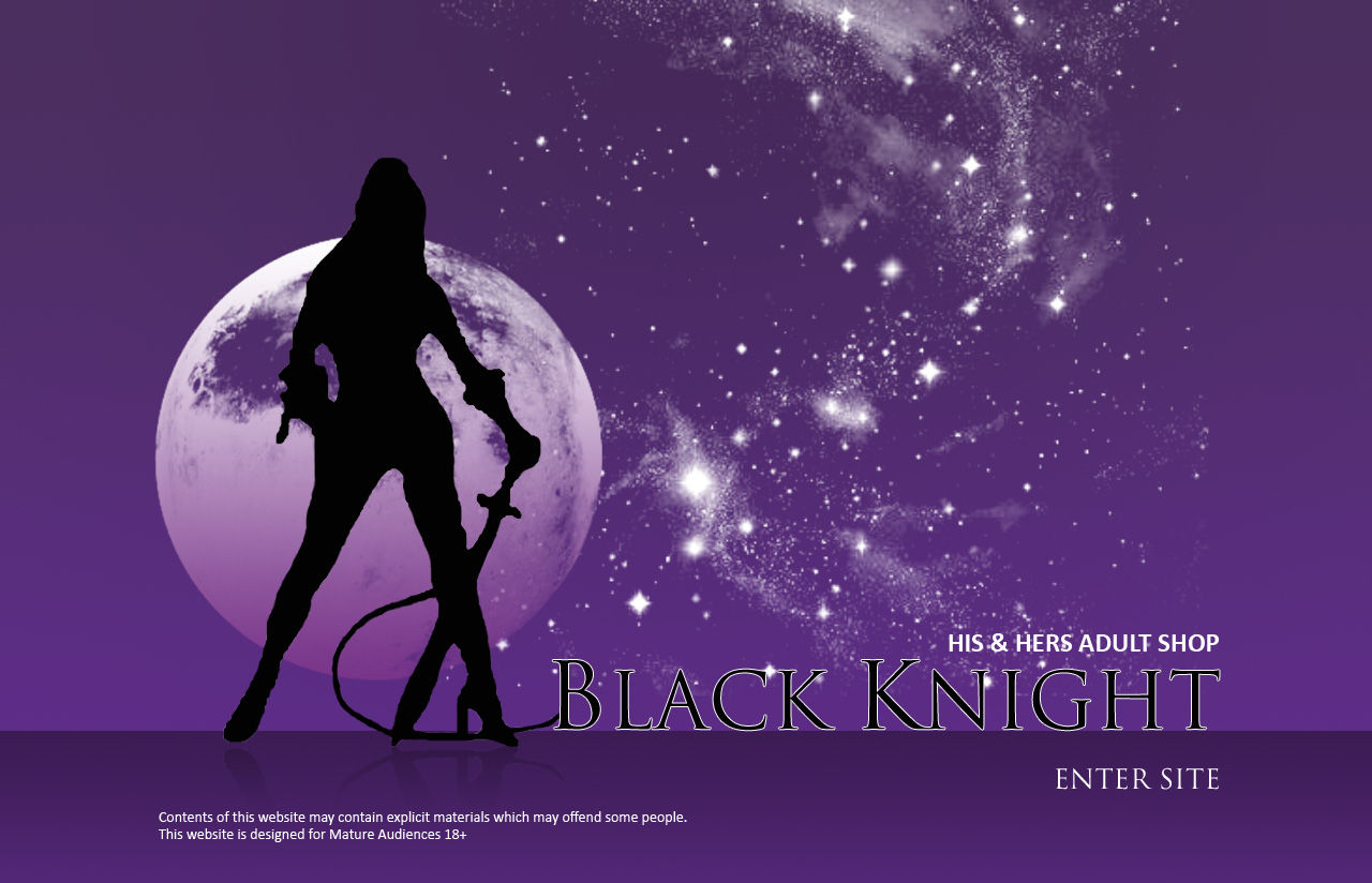
- They would like the Lady larger and on the left of the Splash Page and an Enter Site on the Splash Page. They do not like the gothic font as such however they still want a softer gothic feel and appeal. The client quite likes the use of Trajan Pro font. I have attached a concept they quite liked to give an idea of the direction they would like to head in. This is by no means a suggested look and client is open to more suggestions. They would like to see some attention paid to modifying the lady to bring it up to date.
- The client has suggested a shining moon and some stars in the background of the Splash Page. Here the “under 18” content disclaimer link needs to be put discretely down the bottom of the Splash Page. The woman’s head will eventually be a Flash file which will have her hair flowing.
- When the visitor clicks through the Enter Site they will be shown the inside Home Page of the site with a similar feel to the Splash Page and contain typical menu links such as “about us” and “contact us”. On the Home Page there will be 2 doors “His” and “Hers” where the visitor will click through to the Shop. They like the idea of open doors to enter through. Both “His” and “Hers” shop pages will have the same theme as the Home Page with a minor change in the background. Possibly a darker colour for the males side and a lighter side for the females.
- The client has hand-picked the following images from istock.com. These may be used in the design of the Home Page at the designers discretion. Other similar images can be used to achieve the feel.
- (please search numbers at www.istock.com for thumbnails)
- #1418105
- #2767316
- #2801157
- #4613186
- #9816666
- #5977023
- If designer can also create the Flash component there will be an extra $300 paid. Please let us know.
Nice to have
- Whilst not part of the web design component here it will be of great use if designer had flash skills. This website requires some flash animation on the logo in the Splash Page and header of the Home Page that would require woman’s hair to flow so some ongoing work could be possible for winning designer.
Should not have
- Client has made the comment that they don’t want the site to be “boring and flat”