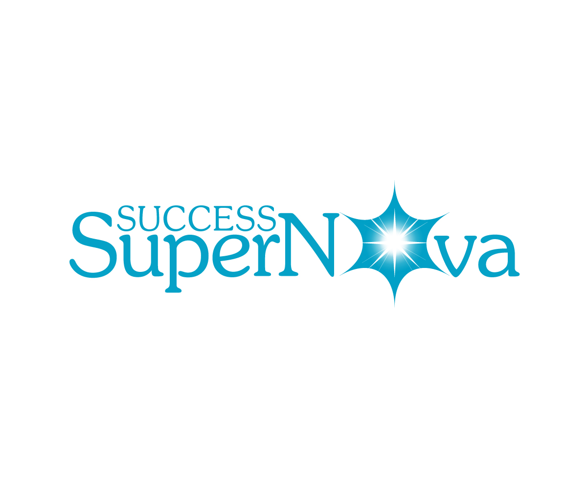
Success SuperNova Business Coaching Logo & Icon Project

Want to win a job like this?
This customer received 228 logo designs from 83 designers. They chose this logo design from Jay Design as the winning design.
Join for free Find Design Jobs- Guaranteed
Logo Design Brief
I need a logo for a rebrand on my Business Coaching business. Through various comprehensive programs we help emerging coaches develop and launch their online coaching business.
We are looking for a "name logo" with an icon. The Icon is that of a realistic-looking star (to match the "supernova" theme). See examples of the kind of star that we're thinking of.
The night sky, constellations, and the outdoors plays heavily into our visual branding. We are looking for a unique (easily recognizable) star shape that suggests an exploding (or radiating) star.
The iconic star needs to be simple enough in shape to be recognizable as a favicon, and will be used against a photo of a nighttime sky and animated to look like an exploding star - so it needs to be somewhat realistic-looking (see the attachment with stars).
I would be great if the star can be a part of the name logo. For example, to represent the "o" in "SuperNova".
As far as the name logo is concerned, the font needs to be strong AND soft (or flowey) at the same time. Please see our brand voice document attached.
Our brand stands for Courage and Compassion. Masculine and Feminine. So for example, fonts with bold lines mixed with soft or brush strokes might work.
The word "Success" should be small with the word, "SuperNova" dominating. Please note the capitalization of the word "SuperNova"
Attached are examples of glowing/exploding stars. Here is a written description of our brand voice: https://docs.google.com/document/d/1Eh_2-CrM14tAeA-XAujPfWb3SmPxoVi6ahTDftw9bE8/edit?usp=sharing
Target Market(s)
Emerging Coaches
Industry/Entity Type
Life Coaching
Logo Text
Success SuperNova
Logo styles of interest
Abstract Logo
Conceptual / symbolic (optional text)
Wordmark Logo
Word or name based logo (text only)
Font styles to use
Colors
Colors selected by the customer to be used in the logo design:
Look and feel
Each slider illustrates characteristics of the customer's brand and the style your logo design should communicate.
Elegant
Bold
Playful
Serious
Traditional
Modern
Personable
Professional
Feminine
Masculine
Colorful
Conservative
Economical
Upmarket
Requirements
Must have
- A star icon and a name logo (wordmark). The star will need to be a simple but unique shape that is still recognizable when it is very small (as in a favicon) and can pass for an exploding star on in a night sky background. It will be animated at a later date.
Nice to have
- it would be nice to have a fairly straightforward name logo that is both strong/courageous and soft/flowey.
- It would be great if the logo can work in a number of ways, meaning a horizontal word mark (with star icon either next to or a part of the name) AND square with the words stacked.
- This is the color palette we've selected for the brand: https://www.pinterest.com/pin/AdUQtolVuRz_BgPoGHhyJgTjmUFUJ2uL04K0NA_X4mNLn6sQGyGOblg/
- It would be nice if the logo works as a lighter turquoise (as it will may be displayed against a night sky background) and black or indigo.
- These are the kind of backgrounds we'll be using (as a video backdrop, on the website, etc):
- https://www.pinterest.com/pin/AeRab2OYVW5AZiImy47AN8QLf4_U3RpqtoN2b_VrejQ_uRyoLmMkkb4/
- https://www.pinterest.com/pin/42362052729614738/
- https://www.pinterest.com/pin/42362052729614759/
- https://pinterest.com/pin/42362052729614753/
Should not have
- We've had one designer take a crack at this project and am attaching the designs we rejected (see "Rejected Logo" and "Rejected Logo2").
- The reason was that the lines were too thin (weak), the star was too complex and weak-looking, and the font was too art-deco-ish, which definitely does NOT fit the brand (see link to brand voice document under Project Description).
- I also attached three badges that we will likely be using for our 3 main programs ... if they mesh with the final logo. If not, we'll redesign those as well.