HUMAN Surveys (Human Understanding Measured Across Nations)
Want to win a job like this?
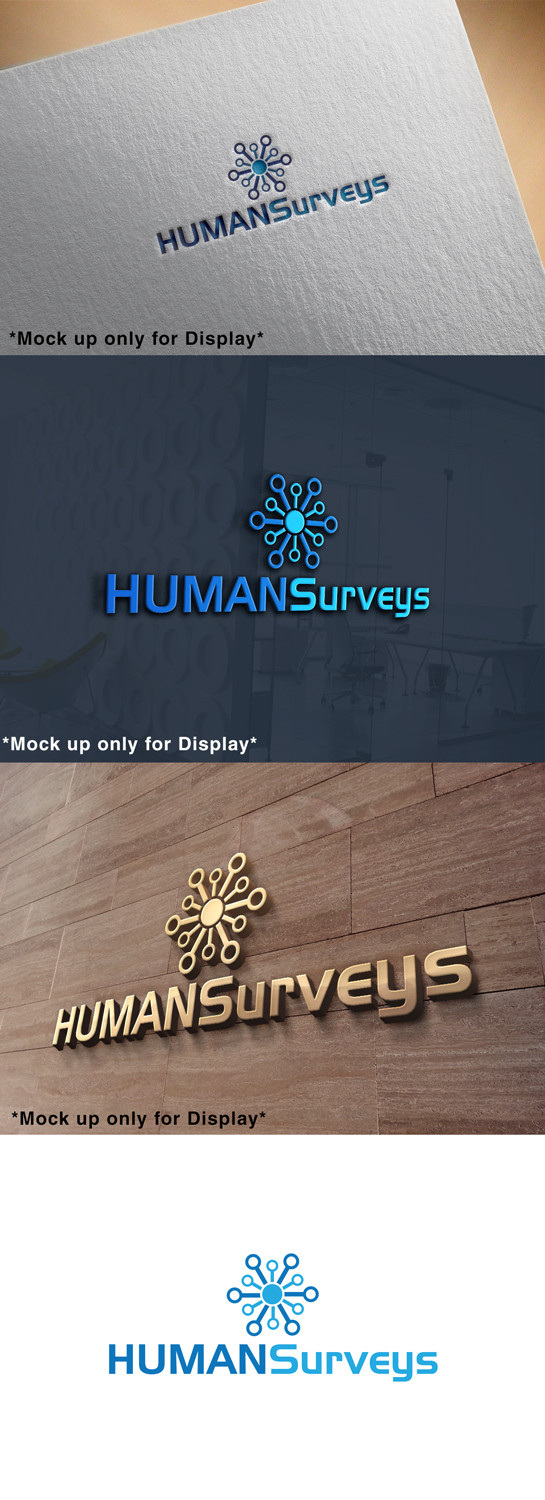
This customer received 225 logo designs from 109 designers. They chose this logo design from marktirumph555 as the winning design.
Join for free Find Design Jobs-
 A$300
A$300
-
 225 designs
-
 109 designers
Logo Design Brief
We need a logo (and later will use this for a branding theme/style) that can be used across a website (humansurveys.org) as well as on cover pages for research reports, title slides for Powerpoint presentations, and the other usual locations online and offline. The purpose of HUMAN Surveys is to format and merge multiple sources of cross-national public opinion surveys (see Sources file for current list). The website will function as a hub for crowd-sourced development of this resource and to provide quality control for successive releases of the merged datasets (see About document for more details). It will also provide instructional videos to help others get involved with the project (see Help file for examples).
Target Market(s)
The primary audience will be academic researchers in universities and institutes, government agencies and non-profit public service organizations, and graduate-level research students. The resource will be most useful to quantitative social scientists, particularly political scientists for version 1, but any discipline concerned with humans could finds the resource useful and this will be increasingly true with future releases that include more variables.
Industry/Entity Type
Academic Training
Logo Text
HUMAN Surveys
Logo styles of interest
Wordmark Logo
Word or name based logo (text only)
Font styles to use
Colors
Designer to choose colors to be used in the design.
Look and feel
Each slider illustrates characteristics of the customer's brand and the style your logo design should communicate.
Elegant
Bold
Playful
Serious
Traditional
Modern
Personable
Professional
Feminine
Masculine
Colorful
Conservative
Economical
Upmarket
Requirements
Must have
- HUMAN Surveys (HUMAN is an acronym here, so it must be capitalized). The logo should probably be these two words (HUMAN Surveys).
Nice to have
- Themes linked to or linking together humans, the world, and data. The project combines data from 160+ countries and it represents the opinions and attitudes of over 8 million of us, so it would be nice if the logo reflects this somehow.