Tony Colangelo Photography requires logo as part of re-brand
Want to win a job like this?
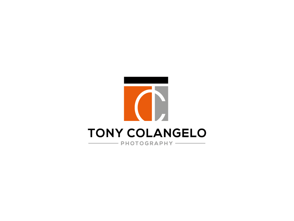
This customer received 151 logo designs from 47 designers. They chose this logo design from berkah dalem as the winning design.
Join for free Find Design Jobs- Bundled Project 1
-
 C$150
C$150
-
 151 designs
-
 47 designers
Logo Design Brief
***PLEASE READ THE BRIEF AND FOLLOW INSTRUCTIONS***
I'm embarking on a re-brand of my photography business and I'm looking for something fresher and more contemporary than my current logo.
I would like to retain my current corporate colours of burnt red/orange + Black + Gray (see www.tcphotography.ca for details.)
I am an award-winning interiors & architectural photographer and I work with the top interior designers, builders and architects in my marketplace. I also coach other photographers all over the world.
I'm hoping that my logo will convey the straight clean lines that is at the heart of the blueprints that my clients use everyday ... but I'm also hoping for some creative flare within the structure formed by those straight lines.
Thank you, in advance, for your consideration and creativity!
Updates
Thanks to all designers who’ve submitted designs to this point. Earlier today, I looked at the four remaining designs to see what they each had in common to determine what I liked about them. What I found is that, to some degree, they all used “implied space” to a great degree -- especially Design #18011947.
This realization inspired me to come up with a design that I’m hoping someone can run with and make better. I’ve uploaded a JPEG to my brief which represents a very rough draft of my thinking. I don’t believe that we need to see the entire T and C of my initials. My design tries to IMPLY them. Furthermore, given that I do photoshoots for high-end interior designers and architects, my photographs have to be very well-composed. One of the composition techniques that I rely on is the “rule of thirds.” As you will see from my design, the vertical line of the T, is placed exactly on the right-vertical line within the rule of thirds … and the spot where the C intersects with the T is exactly at a “powerpoint” position.
I hope that one or more of you will take this design and create something extraordinary for me.
Thank you!!
Added Wednesday, March 14, 2018
Target Market(s)
top interior designers, builders and architects
Industry/Entity Type
Professional Photography
Logo Text
Initials (TC) with Tony Colangelo Photography included somehow, into the design.
Logo styles of interest
Lettermark Logo
Acronym or letter based logo (text only)
Font styles to use
Look and feel
Each slider illustrates characteristics of the customer's brand and the style your logo design should communicate.
Elegant
Bold
Playful
Serious
Traditional
Modern
Personable
Professional
Feminine
Masculine
Colorful
Conservative
Economical
Upmarket
Requirements
Must have
- I would like to retain my current corporate colours of burnt red/orange + Black + Gray (see www.tcphotography.ca for details.)
Should not have
- Please DO NOT incorporate anything to do with a camera (e.g., silhouettes of houses, camera body or lens aperture blades)
- NO cursive fonts please!
- NO black backgrounds please
Files
Payments
Total
C$150
Project Deadline
21 Mar 2018 08:11:10 UTCProject Upgrades
Bundled project(s)
- offering C$39 business card design to winner