Design standards for Saint Petersburg First United Methodist Church
Want to win a job like this?
This customer received 44 graphic designs from 11 designers. They chose this graphic design from pinterferenc86 as the winning design.
Join for free Find Design Jobs- Guaranteed
-
 US$190
-
 44 designs
-
 11 designers
Graphic Design Brief
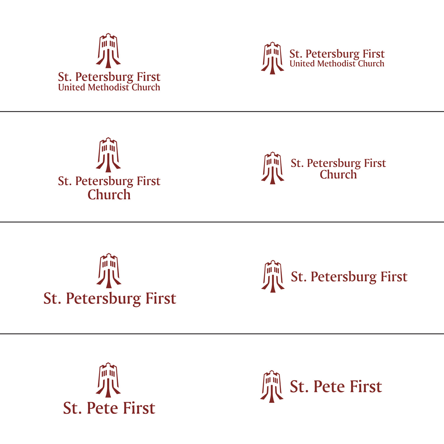
Using existing branding (icon, colors, fonts), create new standards changing the words from "First United Methodist Church" next to the icon to "St. Petersburg First United Methodist Church" with the emphasis on "St. Petersburg First." Please refer to the existing logos and you will see that current emphasis is on "First United" and there is no reference to location.
I am seeking a set of logo treatments that would represent new standards largely using the old brand components to show more of an emphasis on the words "St. Petersburg First." Versions of the logo should also include one with just "St. Petersburg First" next to the icon (i.e., dropping the words "United Methodist Church") and another version that just says "St. Pete First" with the icon that could be used for purposes where it doesn't make sense to have as many words.
St. Petersburg First
United Methodist Church
St. Petersburg First
Church
St. Pete First
See the attached logo files (including one with just the icon) and the website below for the existing logo, colors, etc.
http://fumcsp.com/home
Industry/Entity Type
Religious
Font styles to use
Look and feel
Each slider illustrates characteristics of the customer's brand and the style your logo design should communicate.
Elegant
Bold
Playful
Serious
Traditional
Modern
Personable
Professional
Feminine
Masculine
Colorful
Conservative
Economical
Upmarket
Requirements
Must have
- Three treatments of the same logo (using current fonts, icon, and colors) one each using these words configured like this:
- St. Petersburg First
- United Methodist Church
- St. Petersburg First
- Church
- St. Pete First
Should not have
- Should not change tower icon, color (use the maroon color) or fonts