1700% Campground Membership fee increase info graphic
Want to win a job like this?
This customer received 10 infographic designs from 5 designers. They chose this infographic design from Annie Creative Service as the winning design.
Join for free Find Design Jobs-
 US$110
-
 10 designs
-
 5 designers
Infographic Design Brief
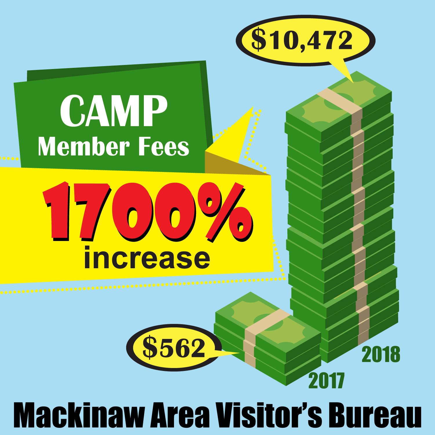
This will illustrate a 1700% rate increase by the Mackinaw Area Visitor Bureau's suddenly imposed on our area's small family operated campgrounds. We are sending this with a press release that will have a political cartoon. So that part is playful - so we want this part to be a bit more serious. We need an info graphic that shows the scale of what a 1700% increase means. Perhaps a photo realistic dollar bill on one pile labeled 2017 (represents rates that year), and a huge pile of cash (1700% bigger) labeled 2018. The labels need to identify that this represents the percentage of rate increase imposed by the Mackinaw Area Visitor's Bureau (their full name) on Mackinaw's Family Campgrounds. The increase should be labeled (or perhaps the whole graphic) as "Campground Membership Fees." It can also be a 3D graphic, but we want it to be polished, but also an attention getter, so if that means some pro but ragged elements, so be it. A chart like something from Excel won't work (to easy to skim over) unless it is something really striking looking. I have attached an Excel chart just for reference, but we want something that get's the same information across in a bit more of an attention getting way. The actual fee increase is based on a 2017 fee of $560 and an increase for 2018 to $10,500. So that could be part of it. I have attached a rough of that idea - again it is just there for the concept, don't let our poor drawing distract you from your good idea. Unless you have a better idea, I am thinking a limited pallette might be best as the cartoon for this release will be in color. However, if you have a great full color idea- please let me see it. Green means money, so I would like that as part of the graphic.
Target Market(s)
This will hopefully appear in newspapers and magazines
Font styles to use
Other font styles liked:
- Something easily read, up to date - you pick
Colors
Designer to choose colors to be used in the design.
Look and feel
Each slider illustrates characteristics of the customer's brand and the style your logo design should communicate.
Elegant
Bold
Playful
Serious
Traditional
Modern
Personable
Professional
Feminine
Masculine
Colorful
Conservative
Economical
Upmarket
Requirements
Must have
- It should be clear from a glance what it is. People skim, it is ok if they have to give it a good look for details.
Nice to have
- perhaps photo realistic money on the stack
Should not have
- Excel looking graphics