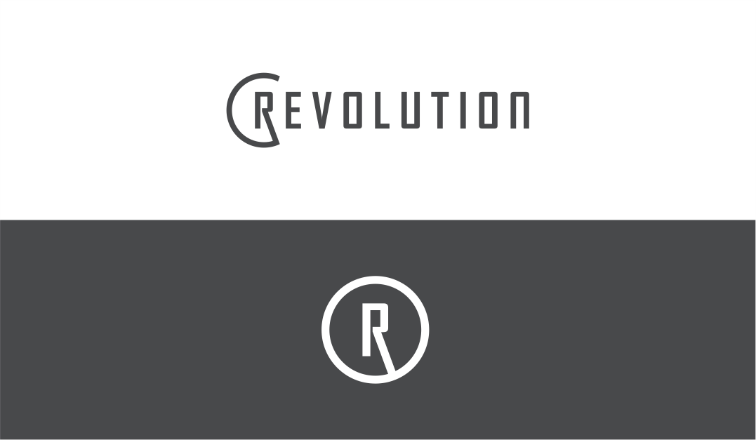
Health and Fitness Company Logo Design

Want to win a job like this?
This customer received 184 logo designs from 52 designers. They chose this logo design from NickStudio as the winning design.
Join for free Find Design JobsLogo Design Brief
We are an all encompassing fitness and health company offering physical therapy, personal trainer, massage therapy, and will be adding yoga, CrossFit, typical gym equipment, and spin. We are called Revolution Sports Medicine, but plan on rebranding just to "Revolution" and want the logo to be modern, bold, minimalistic, and symmetrical. We will be using apparel for advertising, so it should be able to look good on a t-shirt, sleeve, hat, etc. Ideally play off of a circle, possible use of a star or eagle. Negative space is a plus. The logo should be able to stand along for a fitness company and a health company. The logo should also be able to stand alone. Do not play on the letters "RSM", but R can be used for or part of the logo. The logo should be balanced. The logo should mainly be black. Touches of red and yellow are also welcomed (Maryland state flag).
Target Market(s)
Athletes, runners, CrossFitters, and recreational athletes.
Industry/Entity Type
Fitness
Logo Text
REVOLUTION
Logo styles of interest
Emblem Logo
Logo enclosed in a shape
Abstract Logo
Conceptual / symbolic (optional text)
Font styles to use
Other font styles liked:
- Bank Gothic from Vista Print
Look and feel
Each slider illustrates characteristics of the customer's brand and the style your logo design should communicate.
Elegant
Bold
Playful
Serious
Traditional
Modern
Personable
Professional
Feminine
Masculine
Colorful
Conservative
Economical
Upmarket
Requirements
Must have
- Logo to stand alone, an R with a circle around it. Symmetrical.
Nice to have
- Revolution can be used or the R. Black on black would be cool to see (gloss on matte).
Should not have
- Asymmetry, colors other than black, red, yellow, white, and gray.