LOGO DESIGN FOR A BROKERAGE COMPANY

Want to win a job like this?
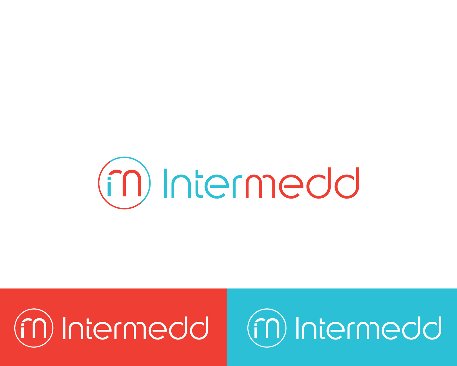
This customer received 169 logo designs from 57 designers. They chose this logo design from Atec as the winning design.
Join for free Find Design Jobs- Guaranteed
Logo Design Brief
The company is a broker that finds dentists who are selling their practice and we find them a buyer. We are commission based just like a real estate agent. The company name is called Intermedd because its short for intermediary i.e broker.
I want a logo that is professional but very edgy and modern and really stands out. I want to use both colours in the logo but one could be used more than the other, its up to you.
A couple of ideas I was thinking about: the 2 letter d's at the end could be intertwined maybe. Also letters could be closer together and maybe we can do something with the r and m. Instead of having an r and m maybe just having the letter m and drawing the r in another colour inside the letter m so that we can tell its the r and m at the same time. Also, the letters e could be rotated or not. Just some suggestions, not necessary to use unless you think they work.
Font to be used: kitami
Colour codes to be used:
Blue: FF3A2B. RBG=255-58-43
Red:CMYK=27C1D6. RGB=39-193-214
Target Market(s)
Dentists
Industry/Entity Type
Healthcare
Logo Text
Intermedd (all in small caps)
Logo styles of interest
Wordmark Logo
Word or name based logo (text only)
Font styles to use
Colors
Colors selected by the customer to be used in the logo design:
Look and feel
Each slider illustrates characteristics of the customer's brand and the style your logo design should communicate.
Elegant
Bold
Playful
Serious
Traditional
Modern
Personable
Professional
Feminine
Masculine
Colorful
Conservative
Economical
Upmarket
Requirements
Must have
- Font kitami that i found on fonts.com
- Colour codes to be used:
- Blue: FF3A2B. RBG=255-58-43
- Red:CMYK=27C1D6. RGB=39-193-214
Nice to have
- It would be nice if the word intermedd can sometimes be all in white on the red background, sometimes on a blue background and also the word itself be in blue and red.
- It would be nice if we can have an emblem on the left side of the word that is inspired from the word not just a random image.