UI/UX Re-Do for CrossPrep - a free to use project management platform for desktop and mobile.
Want to win a job like this?
This customer received 52 web designs from 12 designers. They chose this web design from Impressive Solutions as the winning design.
Join for free Find Design Jobs- Guaranteed
-
 US$571
-
 52 designs
-
 12 designers
Web Design Brief
UI/UX Re-Do for CrossPrep
CrossPrep is a free to use project management platform for desktop and mobile.
We are looking for help with our UI/UX re-design.
As of now the platform is totally functional.
The problem is around flow and look. We want CP to become something that any one can use to manage and even socialize any project. A project can be something work related like organizing a team around a software build, marketing campaign, shared client file space, etc... In fact, most of our current members are using CP for just such work projects.
We also see a project as planning a wedding, organizing a group trip, a simple to-do list, organizing a kids sports team, and so on...
To become a platform that people will use in their work and personal life we first need to become more intuitive and friendly - while maintaining advanced functionality for more advanced needs.
We need help to beautify, streamline, and simplify - while keeping all the functions.
The quickest way to understand CP, and our current issues is this short video:
https://youtu.be/Fo1LO7cCFrY
For sure see this link for the entire most recent description AND images:
https://crossprepapp.com/?p=GevsA8XBaQV
The best way to understand CP is to actually use it:
https://crossprepapp.com
Should you choose to take a run at improving CP here are the details:
Please focus your ideas for mobile, it's where we have the biggest issues.
Feel free to get outside the box.
Avoid swipe oriented designs.
Feel free to focus on ideas over polished outputs.
Use any tool you like, PS, hand drawing, written description if you think that works best.
(FYI - we use mostly use Google Presentation docs internally)
Point is illustration of ideas over tool choice.
Feel free to:
Create something totally new
And/or riff on what we have now
And/or riff on the new design we are considering (see images below)
|||
If we go the direction of the images/designs below the idea is to give people options on how they see/experience CP.
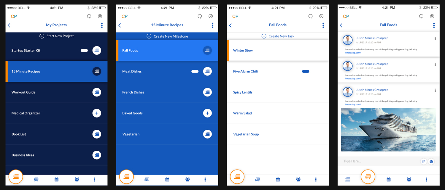
Just below is what we are calling Ground View. This is a more basic and simple flow. Probably a default to keep new users feeling comfortable at the start.
<img src="https://i.imgur.com/5rcRYKM.jpg" style="width: 100%;">
https://i.imgur.com/5rcRYKM.jpg
|||
We are calling this optional view Sky View. It is more advanced and can show all project, goal(renamed 'milestones') at the same time. This is more of a paint job on the current design.
<img src="https://i.imgur.com/gqzKPPt.jpg" style="width: 100%;">
https://i.imgur.com/gqzKPPt.jpg
|||
If you're submitting please let us know if you can also do the PS files for dev.
Not required, but once we nail down the concepts we want someone to hone in the PS files.
As an optional bonus we will also be giving credit to you/your company in CP.
Let us know if you do or don't want that.
We are excited to see your work!!
<img src=" " style="width: 100%;">
Target Market(s)
Anyone who needs to organize any project, big or small. The key is to make a super friendly user experience for new users while retaining advanced functions.
Industry/Entity Type
Management
Number of Pages Required
2 page
Look and feel
Each slider illustrates characteristics of the customer's brand and the style your logo design should communicate.