

 Refresh
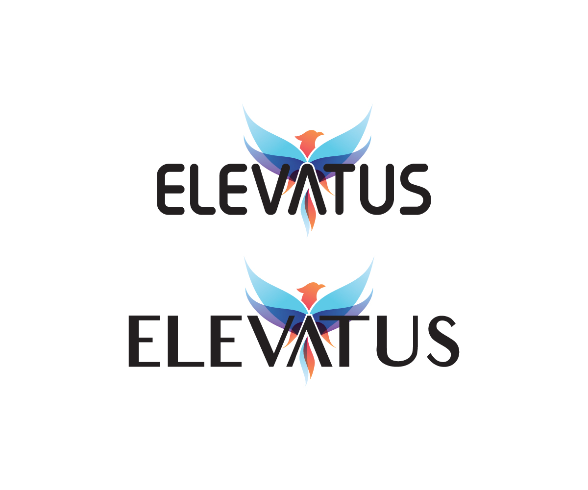
Elevatus Foundation, inc. Logo - Non-Profit Rebranding Logo
Want to win a job like this?
This customer received 24 logo designs from 4 designers. They chose this logo design from CHAN GRFX as the winning design.
Join for free Find Design Jobs
- Guaranteed
-
 US$150
-
 24 designs
-
 4 designers
Logo Design Brief
We are a non-profit focused on helping to empower people in some of the poorest areas in the world. We help with micro loans, building schools, and much more. We are looking for help with a logo to represent our organization as we are re-branding now to be able to work internationally not just in Africa where we have been. Our name was picked because "Elevatus" means Elevate in latin and we want to help people lift themselves out of poverty but be the conduit that helps them. We like the "hope" font on the shirt of the attachment below. We also like the idea of a circle and a multicolored logo. Our current website which will be changed to elevatusfoundation.org soon is madagascarcf.org if you would like to check out more about us.

Updates
Project Deadline Extended Reason: We are extending this deadline to get the best possible result, we realize that something this important for our non-profit should be given more time than we original put on the timeline. Thank you. Added Saturday, August 19, 2017
Target Market(s)
middle class single and married women ages 35 to 60
Industry/Entity Type
Non-Profit
Logo Text
Elevatus Foundation
Logo styles of interest
Wordmark Logo
Word or name based logo (text only)


Colors
Colors selected by the customer to be used in the logo design:
Look and feel
Each slider illustrates characteristics of the customer's brand and the style your logo design should communicate.
Elegant
Bold
Playful
Serious
Traditional
Modern
Personable
Professional
Feminine
Masculine
Colorful
Conservative
Economical
Upmarket
Requirements
Must have
- we would like one version with just our name "Elevatus" and another with Elevatus and our tagline and a third with Elevatus Foundation and our tagline included on the second line underneath, the tagline is "Educate. Embrace. Empower."
- Needs to be more feminine. The two attachments with the doterra logo and the branding from the sharesuccess.com and the attachment speaks really well to the branding that is perfect for our ideal target market.
Nice to have
- We also really like the people holding hands in the shape of a "V" or the phoenix pictures which could be used for the "V" in the logo. possibly a mutlicolor logo (see attached Liahona foundation). possibly incorporating an accent on the word US in Elevatus.


