Higher Mountain Church Logo Branding & Grand Opening!
Want to win a job like this?
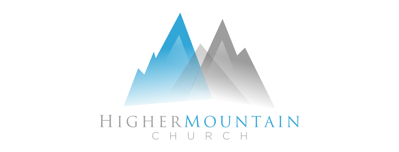
This customer received 45 logo designs from 10 designers. They chose this logo design from CHRISTIANDESIGN as the winning design.
Join for free Find Design Jobs-
 US$200
-
 45 designs
-
 10 designers
Logo Design Brief
We are Higher Mountain Church, a new church plant for the next generation, and we are using the help of the existing generation as well. We are a creative church culture on the cutting edge make it a solid brand and make the logo Greater than it already is. Remove the Cross and the Sun Rays' keep the "M concept which is also a mountain", because the name is Higher Mountain Church. Make the letters modern and stand out! Make the letters Unique, NOT just a standard font!
Updates
Hello here's an idea: We would like the logo to speak to the people saying They can be taken"Higher in their life to a new level of success and peace. As for the name of the church try to incorporate a nice color that blends with Teal blue. A color that may go with teal blue is "Grey" or maybe white and black. Try to incorporate MOUNTAIN in the "Letter M in the name of the Church (ex. "Higher Mountain Church" ) that M should be the mountain. Please take a look at the new uploads on our project description page. Let's try something totally different from our original design and see what happens with going that route. Thank you for your ideas and designs.
Added Saturday, November 02, 2013
Hello everyone, thanks for the submissions. After further discussions with our staff we have
came up with an idea and would like to see how it would look if we had something like this:
Added Sunday, November 03, 2013
Target Market(s)
Ages 20-38
Industry/Entity Type
Church
Logo Text
Higher Mountain Church
Logo styles of interest
Emblem Logo
Logo enclosed in a shape
Pictorial/Combination Logo
A real-world object (optional text)
Abstract Logo
Conceptual / symbolic (optional text)
Character Logo
Logo with illustration or character
Lettermark Logo
Acronym or letter based logo (text only)
Font styles to use
Other font styles liked:
- Something Modern and Innovative.
Colors
Colors selected by the customer to be used in the logo design:
Look and feel
Each slider illustrates characteristics of the customer's brand and the style your logo design should communicate.
Elegant
Bold
Playful
Serious
Traditional
Modern
Personable
Professional
Feminine
Masculine
Colorful
Conservative
Economical
Upmarket
Requirements
Must have
- An "M style Mountain"
Nice to have
- A Simple Young, yet mature, blend between feminine and masculine, it must be obvious, a solid brand, memorable, timeless. It also must luxury yet Economical, and Loud! Blue as the main color "The Mountain" Nice to be simple yet effective!
Should not have
- Please do not put Cross in the Logo, nor sun ray's. Do not use old style, serif fonts like Times New Roman etc. It must stand out!