Tampa Bay Tech Logo (help brand an entire community!)
Want to win a job like this?
This customer received 154 logo designs from 51 designers. They chose this logo design from Atec as the winning design.
Join for free Find Design Jobs- Guaranteed
-
 US$150
-
 154 designs
-
 51 designers
Logo Design Brief
We have a very specific icon concept - a three node network diagram, with the second node extended to the right, like a greater than sign or arrow pointed to the right. Please see the attached examples.
Be creative! We fully understand we are selecting an icon with a pre-established/dual meaning that *could* be viewed as generic. We want, pardon the pun, for our icon to be iconic.
We also envision the logo in a solid color palate, most likely displayed in solid black as our standard mark.
Regarding fonts, we'd like to use one of the following Google fonts, in no particular order of preference:
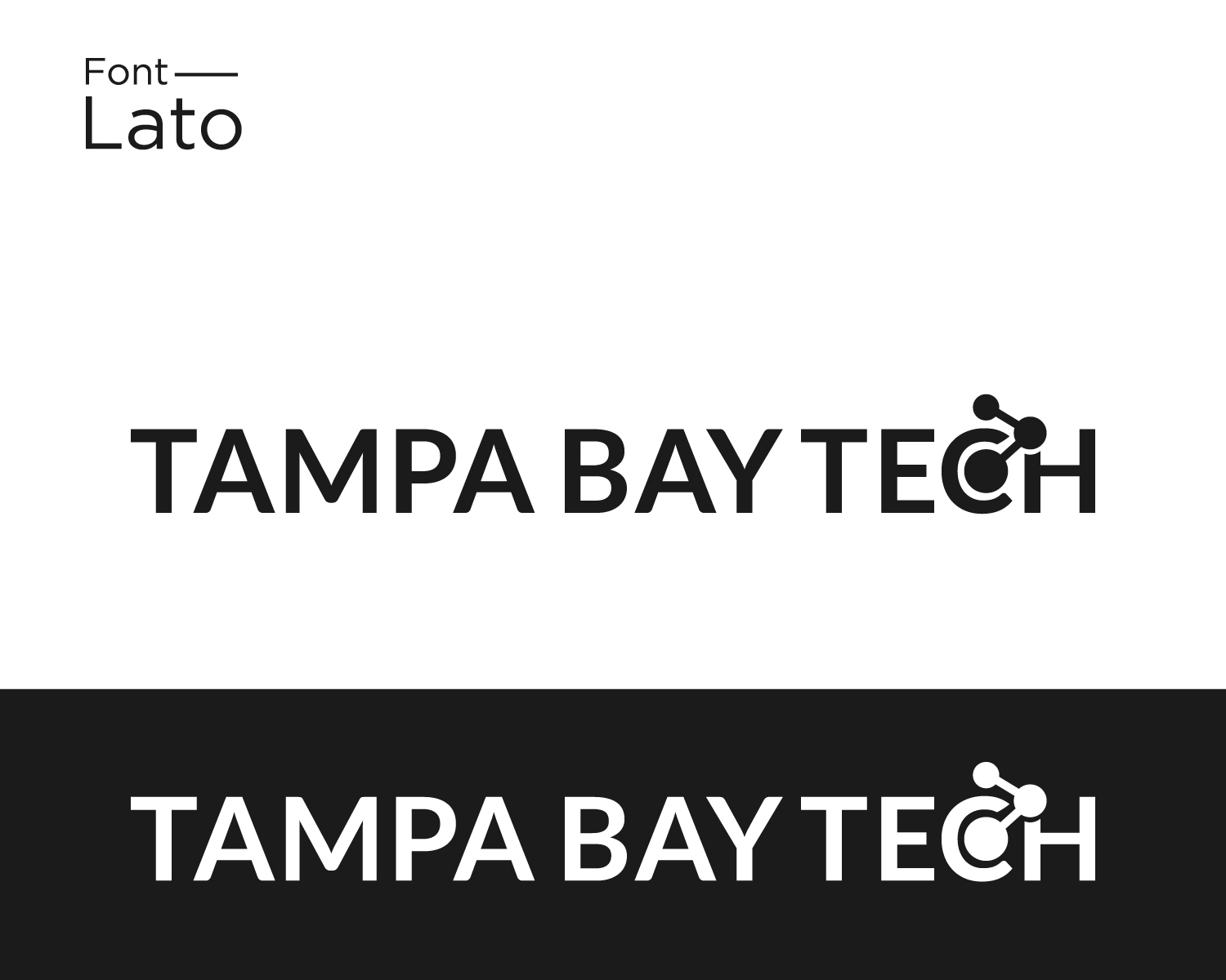
https://fonts.google.com/specimen/Lato
https://fonts.google.com/specimen/Montserrat
https://fonts.google.com/specimen/Open+Sans
https://fonts.google.com/specimen/Roboto
We are leaning to the logo text being all capital; however, are flexible for the right mix of icon and font.
Target Market(s)
Technology companies and employees. Approximately 1 out of every 89 US tech employees are employed in Tampa Bay.
Industry/Entity Type
Tech
Logo Text
Tampa Bay Tech
Logo styles of interest
Pictorial/Combination Logo
A real-world object (optional text)
Abstract Logo
Conceptual / symbolic (optional text)
Font styles to use
Colors
Designer to choose colors to be used in the design.
Look and feel
Each slider illustrates characteristics of the customer's brand and the style your logo design should communicate.
Elegant
Bold
Playful
Serious
Traditional
Modern
Personable
Professional
Feminine
Masculine
Colorful
Conservative
Economical
Upmarket
Requirements
Must have
- "Tampa Bay" is the region we represent, and must be portrayed as a full phrase.
- "Tampa Bay Tech" must be spelled out in full, no abbreviations.