Major Australian Food and Wine Event Web Design Project
Want to win a job like this?
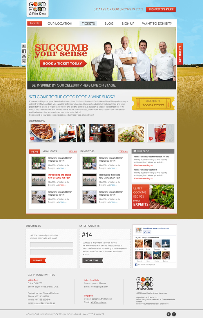
This customer received 76 web designs from 20 designers. They chose this web design from the-lion-king as the winning design.
Join for free Find Design Jobs- Guaranteed
-
 A$1460
-
 76 designs
-
 20 designers
Web Design Brief
The project will consist of 3 designs
The homepage
A city hub page
A general content page
The main audience who will visit the website will be (in Order of importance:
1) Visitors
- Mainly women 24 – 54 years (they are the main ticket buyers)
- In a relationship – so will go to the show with their partner
- In a good paying job or home maker – and who have disposable income to spend $30 a ticker
- Enjoy food, wine and going out
- Looking for a fun day out – although an event that is about food and wine – it is an event that most people will go to and have a fun day out – not too pretentious
A smaller proportion of the audience will be:
2) Exhibitors & sponsors ( both prospective and existing)
3) Media
Objectives:
- Functionality on home page and sub pages needs to be updated, clear, easy to navigate and inject a sense of ‘fun’ – need to make it look more professional
- Need to incorporate the many things that need to be on the home page and sub pages in a visually appealing manner
- Ensure the ‘Cons’ above are considered and reflected in functionality and design
- To not be too focus on the colours (these can be changed) – but focus on the functionality and overall design opportunities.
Approach:
Keywords to describe the Good Food & Wine Show:
Fun day out, discover, learn, indulge, entertaining
Other website examples:
Some great consumers event websites from the UK really make our website look basic and juvenile – and below are some examples of the presentation of how we would like our website to look like:
http://www.tastefestivals.com/london/ This website is clean, includes good social media integration and exudes a sense of fun. Their content pages, such as the features landing page also presents options in a clear and visually appealing way with a series of boxes including image and text http://www.tastefestivals.com/london/content/343/Features
http://www.granddesignslive.com/ - this is also a great website – and it incorporates all the elements we would be looking for on our homepage – but the background/skin also includes a sense of fun and cheekiness. Subpages also are consistent.
Features
• Its a fun day that offers great value for money
• Caters to all visitors, regardless of different levels of knowledge or interest in food, wine and cooking.
• Sample great quality food and wine products from hundreds of reputable exhibitors
• Learn more through many of the shows feature activities (Celeb Theatre, Wine Theatre, Cooking & Cheese Classes)
Functionality & Structure:
In a user friendly, easy to view way, we need to incorporate the following functionality elements on home page:
- main header (that will incorporate our current creative) with a ‘fun’ skin
- navigation tabs/references (hone, location, tickets, blog, sign up, exhibitors)
- navigation/content banner (rotating)
- Area for small intro about the show
- News and highlight section
- New exhibitors section
- Obvious Ticket call to action
- Obvious sign up call to action
- Social media buttons or links ( really like the moving gifs on the Grandesignslive.com site
- area for advertising (MREC size) to sell to exhibitors/sponsors
- Show dates for all 5 shows (maybe in main header)
Subpage layout is also important and needs to reflect the homepage – so would also like to see examples of how this would look and tie in with navigation – we generally have a lot of content on these pages, so clear navigation would be useful. – see below for further details of functionality for city Hubs
‘CITY HUB’ BRIEF
When navigating to each location the user will be taken to a ‘CITY HUB’ which should replicate design and content elements of a main HOME page, as well as reflect more specific information for each Show. Elements which must appear on this page are:
• FEATURES – which may be displayed in categories (in boxes, see appendix 1.0) which will link through to relevant content pages. Or in one box which will link through to a features page with all presented in boxes
• CHEFS – may be displayed as a separate icon box which will link to chefs page with bios, Celeb Theatre timetable etc.
• TICKETS – either a button or clear callout to purchase tickets
• PLAN YOUR DAY – may be displayed in a separate content box which will then link through to getting there, sample itineraries and downloadable pocket show guide for visitors to print before coming to the Show.
• WHO’S EXHIBITING – to link back to city specific exhibitor lists
Our current website is out of date and has the following inadequacies (www.goodfoodshow.com.au) -
The project will consist of 3 designs
The homepage
A city hub page
A general content page
The main audience who will visit the website will be (in Order of importance:
1) Visitors
- Mainly women 24 – 54 years (they are the main ticket buyers)
- In a relationship – so will go to the show with their partner
- In a good paying job or home maker – and who have disposable income to spend $30 a ticker
- Enjoy food, wine and going out
- Looking for a fun day out – although an event that is about food and wine – it is an event that most people will go to and have a fun day out – not too pretentious
A smaller proportion of the audience will be:
2) Exhibitors & sponsors ( both prospective and existing)
3) Media
Objectives:
- Functionality on home page and sub pages needs to be updated, clear, easy to navigate and inject a sense of ‘fun’ – need to make it look more professional
- Need to incorporate the many things that need to be on the home page and sub pages in a visually appealing manner
- Ensure the ‘Cons’ above are considered and reflected in functionality and design
- To not be too focus on the colours (these can be changed) – but focus on the functionality and overall design opportunities.
Approach:
To be perceived as a fun, entertaining event with something for everyone - website creative and navigation must reflect this.
Keywords to describe the Good Food & Wine Show:
Fun day out, discover, learn, indulge, entertaining
Other website examples:
Some great consumers event websites from the UK really make our website look basic and juvenile – and below are some examples of the presentation of how we would like our website to look like:
http://www.tastefestivals.com/london/ This website is clean, includes good social media integration and exudes a sense of fun. Their content pages, such as the features landing page also presents options in a clear and visually appealing way with a series of boxes including image and text http://www.tastefestivals.com/london/content/343/Features
http://www.granddesignslive.com/ - this is also a great website – and it incorporates all the elements we would be looking for on our homepage – but the background/skin also includes a sense of fun and cheekiness. Subpages also are consistent.
Features
• Its a fun day that offers great value for money
• Caters to all visitors, regardless of different levels of knowledge or interest in food, wine and cooking.
• Sample great quality food and wine products from hundreds of reputable exhibitors
• Learn more through many of the shows feature activities (Celeb Theatre, Wine Theatre, Cooking & Cheese Classes)
Functionality & Structure:
In a user friendly, easy to view way, we need to incorporate the following functionality elements on home page:
- main header (that will incorporate our current creative) with a ‘fun’ skin
- navigation tabs/references (hone, location, tickets, blog, sign up, exhibitors)
- navigation/content banner (rotating)
- Area for small intro about the show
- News and highlight section
- New exhibitors section
- Obvious Ticket call to action
- Obvious sign up call to action
- Social media buttons or links ( really like the moving gifs on the Grandesignslive.com site
- area for advertising (MREC size) to sell to exhibitors/sponsors
- Show dates for all 5 shows (maybe in main header)
Subpage layout is also important and needs to reflect the homepage – so would also like to see examples of how this would look and tie in with navigation – we generally have a lot of content on these pages, so clear navigation would be useful. – see below for further details of functionality for city Hubs
‘CITY HUB’ BRIEF
When navigating to each location the user will be taken to a ‘CITY HUB’ which should replicate design and content elements of a main HOME page, as well as reflect more specific information for each Show. Elements which must appear on this page are:
• FEATURES – which may be displayed in categories (in boxes, see appendix 1.0) which will link through to relevant content pages. Or in one box which will link through to a features page with all presented in boxes
• CHEFS – may be displayed as a separate icon box which will link to chefs page with bios, Celeb Theatre timetable etc.
• TICKETS – either a button or clear callout to purchase tickets
• PLAN YOUR DAY – may be displayed in a separate content box which will then link through to getting there, sample itineraries and downloadable pocket show guide for visitors to print before coming to the Show.
• WHO’S EXHIBITING – to link back to city specific exhibitor lists
Our current website is out of date and has the following inadequacies (www.goodfoodshow.com.au) -
- Dated design/layout
- Homepage too text heavy
- No content boxes that can be used for different features/areas (eg. News, Exhibitors etc)
- Uninspiring colours and skin(eg. grey background), does not reflect ‘a fun day out’
- Limited presence of social media platforms and lacks ‘community’
- No continuity in sub pages
- main banner too big – takes up too much space on homepage
Updates
Project Deadline Extended
Added Friday, February 03, 2012
Industry/Entity Type
Advertising
Look and feel
Each slider illustrates characteristics of the customer's brand and the style your logo design should communicate.
Elegant
Bold
Playful
Serious
Traditional
Modern
Personable
Professional
Feminine
Masculine
Colorful
Conservative
Economical
Upmarket
Requirements
Must have
- As per above brief.
In addition:
Floating social media buttons on side
Wrap around image
Drop down menu (specifically for the location nav item)
To be perceived as a fun, entertaining event with something for everyone - website creative and navigation must reflect this.