BACH LOGO DESIGN FOR HIIT, YOGA, and MEDITATION WELLNESS CENTER
Want to win a job like this?
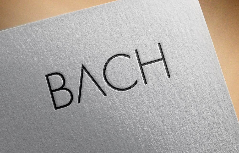
This customer received 266 logo designs from 83 designers. They chose this logo design from Creative Hayat N as the winning design.
Join for free Find Design Jobs-
 US$270
-
 266 designs
-
 83 designers
Logo Design Brief
We need a new logo for a fitness/wellness center based in Atlanta, GA called "BACH". Bach in new zealand means a second, usually modest beach home that is used for holiday season. The overall feel we want to create is one "of a second home", for our clients, that is very welcoming and inviting to all since we will have: HIIT, yoga and meditation classes inside the studio and an eclectic clientele mix.
Our founder is from New Zealand so we are using the country's silver fern design as the stand out artwork within our logo.
We want the fern to be dominate throughout the logo, but have only done some cheesy renderings ourselves below.
We would like to design a very modern fern specific to us (not exact replicas to the ones on the internet, like 2 of my attachments)
and we would like to see the fern either:
1. faded all the way through the BACH design
2. much larger than the example, but have the fern run the entire front side of the "A" in BACH
3. Whatever you think works from your artistic point of view
Target Market(s)
fitness/wellness upper end clientele 25-50
Industry/Entity Type
Health And Wellness
Logo Text
BACH
Logo styles of interest
Abstract Logo
Conceptual / symbolic (optional text)
Font styles to use
Other font styles liked:
- modern sleek font
Colors
Colors selected by the customer to be used in the logo design:
Look and feel
Each slider illustrates characteristics of the customer's brand and the style your logo design should communicate.
Elegant
Bold
Playful
Serious
Traditional
Modern
Personable
Professional
Feminine
Masculine
Colorful
Conservative
Economical
Upmarket
Requirements
Must have
- modern/sleek lettering for "BACH"
- black/white/grey color scheme
- custom new zealand fern specific to our business
- we would like to see the fern incorporated in the BACH logo either:
- 1. faded throughout the word itself
- 2. as one side of the letter "A" in BACH
- 3. whatever you think looks best as an artist working on the project
Nice to have
- ambient lighting behind the entire design (to give that raised look feel and also add a level of class)
Should not have
- no made up logos outside of the description