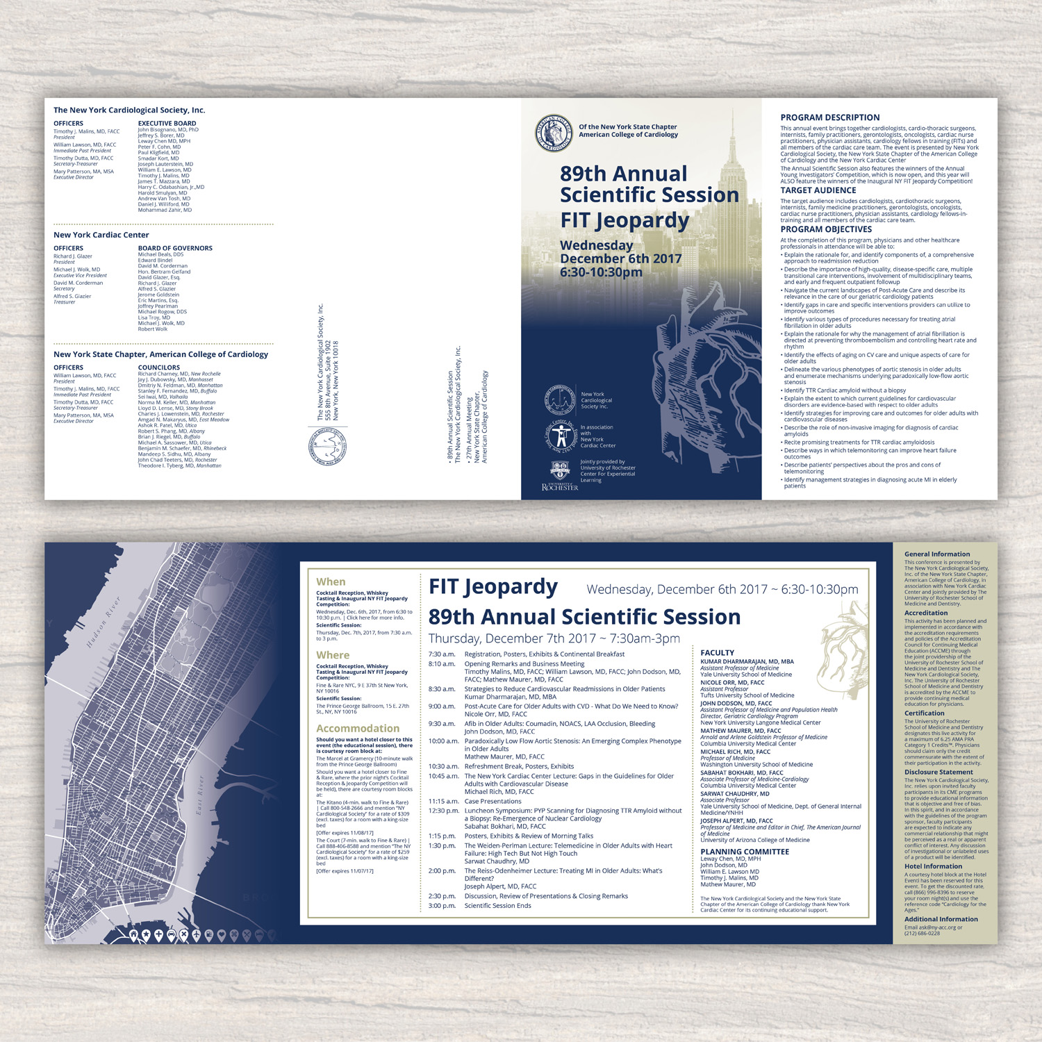
Double-Gate-Fold Mailer (8-panels)

Want to win a job like this?
This customer received 20 brochure designs from 10 designers. They chose this brochure design from Katyas Art and Design as the winning design.
Join for free Find Design Jobs- Guaranteed
Brochure Design Brief
I have an 8-panel brochure/mailer that I need designed. We're looking for something very classy and professional-looking (both in the fonts and the imagery chosen), as this is for a medical educational event for doctors - and our members are very discerning.
We're open to any design idea that fits within the parameters given below, but if it helps, our primary color is PMS 295 (Hex #002e5a) and we often use PMS 452 (Hex #aaa77e) as a contrasting color.
Images using the NYC skyline or major landmarks are fine, as this will be held in NYC again this year. I have attached photos of the venues that could be used as pop-out images, faded background images or for other inspiration. (I do not have higher-resolution versions of any of the venue photos.)
More info about this event can be found here: http://ny-acc.org/2017annualmtg/
Important Notes:
- This year's mailer needs to be 20.75" x 8.75” (flat), which will be folded down to 5.19" x 8.75" ultimately.
- I will provide final text for designer, but I have attached last year's mailer so that you can use the content from this as placeholder text. Latin text is also fine - just looking for the design right now.
- *** This year's mailer WILL NOT HAVE a registration form, so please don't include the registration form portion in your design. *** We have, however, added an extra session this year (the day before), so the extra space could be used to promote this new 4-hour event.
- In case it matters to your design, the two events will be in two different locations.
- Final deliverable must include raw files, including main project file (either .ai, .idml, or psd format) and fonts, images, etc.
Updates
Project Deadline Extended Reason: While there are a couple that are interesting and some that are close to our in-house style and tone, I haven't yet seen an outstanding entry (one that followed the directions) yet, especially with respect to subtle/minimal imagery. I would like to give it a few more days. Added Wednesday, July 19, 2017
Target Market(s)
Physicians, nurses, technologists (Please do not use stock images of physicians, nurses, etc. This is a direct-mail brochure; they will know it is for them.)
Industry/Entity Type
Education
Font styles to use
Colors
Designer to choose colors to be used in the design.
Look and feel
Each slider illustrates characteristics of the customer's brand and the style your logo design should communicate.
Elegant
Bold
Playful
Serious
Traditional
Modern
Personable
Professional
Feminine
Masculine
Colorful
Conservative
Economical
Upmarket
Requirements
Must have
- Must have room for all content to fit. Last year's brochure is attached as an example of the amount of content there will be. I have attached the five (5) logos that will (eventually) need to be on the brochure. They can be added later either in full color or monotone.
- This year doesn't have a theme like last year. The title of the event is simply: "The 89th Annual Scientific Session & Inaugural FIT Jeopardy Competition"
Nice to have
- Nice to have a design that somehow coordinates with our logos, which, as you can see, range in color from dark blue to light blue, but this isn't necessary, as our logos can all be monotone if necessary. It would be nice if the designer could keep the horizontal-style of the art, similar to last year's, but it's not a requirement.
Should not have
- Images should be subtle, faded or pushed to the background. Please don't include stock images of people, physicians working, medical equipment, etc. (This is a highly specialized field of medicine, and generic stock images look very strange and, at best, are a misrepresentation of these doctors.) Art should not be to "cartoon-y" either or have too many distracting images.