Logo design project for Advance Injury Prevention
Want to win a job like this?
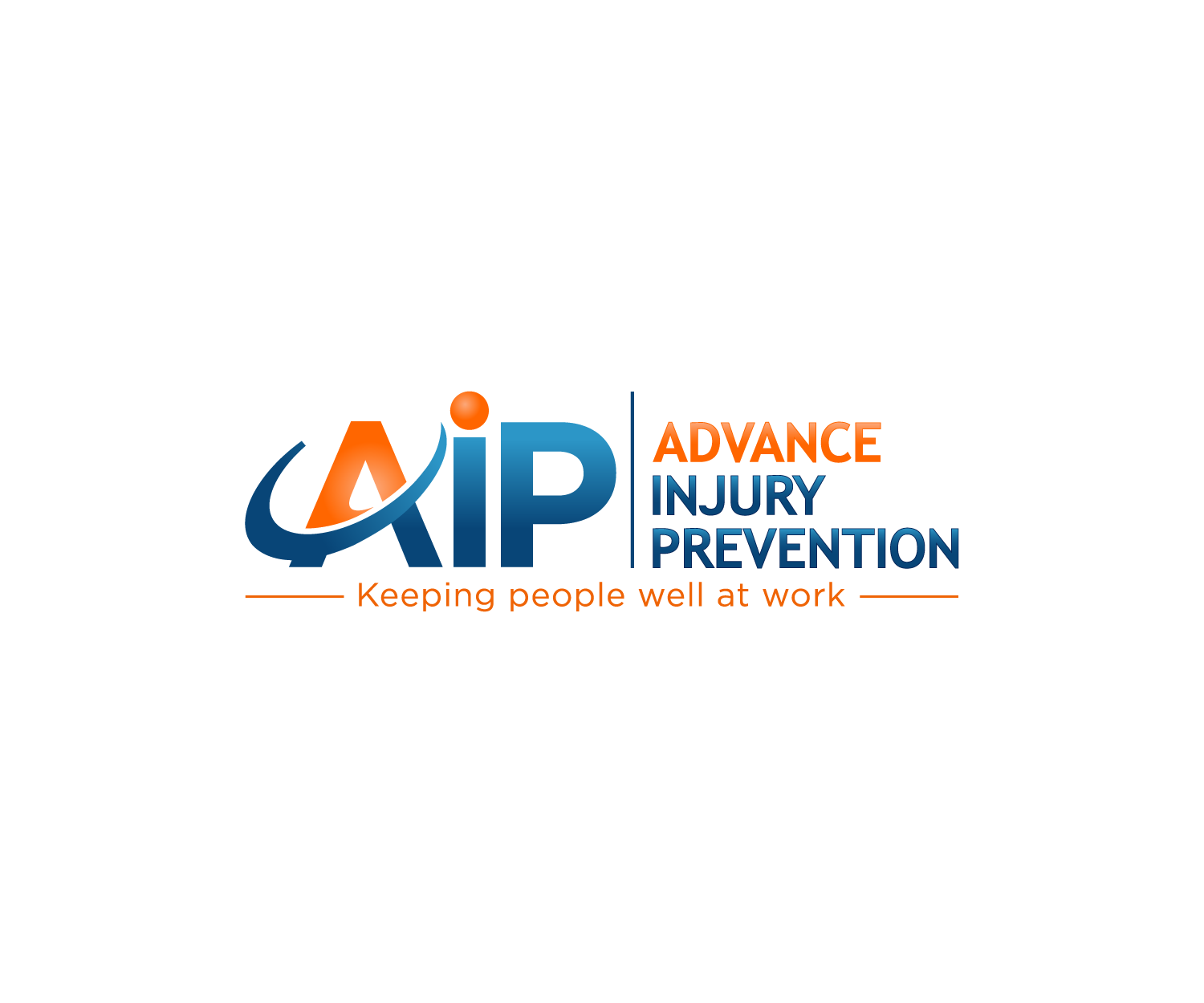
This customer received 212 logo designs from 55 designers. They chose this logo design from Mario as the winning design.
Join for free Find Design Jobs-
 A$150
A$150
-
 212 designs
-
 55 designers
Logo Design Brief
We need a logo design for a business based in Sydney, Australia called Advance Injury Prevention. We provide training programs and assessment services to companies to keep their workers healthy and safe at the workplace and to prevent injuries. For example, we train people in manual handling and office ergonomics and we conduct workplace assessments and provide advice to teach workers how to use safe work practices and avoid injury. The aim of our business is to reduce workers compensation costs for organizations by reducing the incidence of injury in the workplace. We like the colours blue and orange (more blue and less orange). We would like the initials AIP to be part of logo as well as the tagline "Keeping people well at work" at the bottom of the logo. The final design should communicate professionalism and continual progress and improvement.
Target Market(s)
Sydney – based medium to large companies and corporations.
Contact person may be WHS managers, HR managers, HSE managers, HSW managers.
Industry/Entity Type
Health Service
Logo Text
Advance Injury Prevention
Logo styles of interest
Abstract Logo
Conceptual / symbolic (optional text)
Font styles to use
Colors
Colors selected by the customer to be used in the logo design:
Look and feel
Each slider illustrates characteristics of the customer's brand and the style your logo design should communicate.
Elegant
Bold
Playful
Serious
Traditional
Modern
Personable
Professional
Feminine
Masculine
Colorful
Conservative
Economical
Upmarket
Requirements
Must have
- The colours blue and orange (more blue than orange).
- The acronym AIP should stand out clearly on the logo.
- Must look professional.
- Must be a very clear font and easy to read.
- Must be very simple.
- Tagline (keeping people well at work) to be included in the logo.
Nice to have
- An simple icon which symbolises progress, improvement or direction
- The acronym AIP could possibly be incorporated into a symbol.
Should not have
- • No running writing
- • No fonts that are difficult to read or recognise
- • No letters in georgraphic shapes
- • The logo must not appear busy or messy-looking
- • The icon should not have a Cog icon
- • No Clip art
- • No illustrations or characters