Australian Hearing Health NFP needs a logo design
Want to win a job like this?
This customer received 137 logo designs from 42 designers. They chose this logo design from sonym as the winning design.
Join for free Find Design Jobs-
 A$150
A$150
-
 137 designs
-
 42 designers
Logo Design Brief
HEARsmart is a small NFP interested in promoting hearing heath to prevent noise-induced hearing loss and tinnitus (www.hearsmart.org) - with a particular interest in musicians and the music industry.
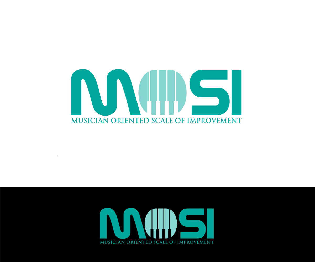
HEARsmart has a strong grounding in Audiology and has developed a tool (or survey) to help Audiologists with clients who are musicians and others working in the music industry. The tool is called the Musician Oriented Scale of Improvement or MOSI for short.
Target Market(s)
Audiologists - hearing health professionals for their professional work
Industry/Entity Type
Health
Logo Text
MOSI (main) Musician Oriented Scale of Improvement (smaller text, more like a tag line)
Logo styles of interest
Lettermark Logo
Acronym or letter based logo (text only)
Font styles to use
Colors
Designer to choose colors to be used in the design.
Look and feel
Each slider illustrates characteristics of the customer's brand and the style your logo design should communicate.
Elegant
Bold
Playful
Serious
Traditional
Modern
Personable
Professional
Feminine
Masculine
Colorful
Conservative
Economical
Upmarket
Requirements
Must have
- - MOSI as the clear main words in the logo and Musician Oriented Scale of Improvement also in there to detail what that stands for.
- - Some attachment to the HEARsmart brand would be good - note the banner is about to change on the webpage to something lighter with brand colors being more of the orange, purple and teal than the dark orange and black.
- - Must work well in B/W a well as colour.
Nice to have
- Remember the tool is for the audiologist to us with any one working in the music industry - musicians themselves, sound engineers, venue staff