Logo design for new Real Estate Firm/Team in Toronto Canada
Want to win a job like this?
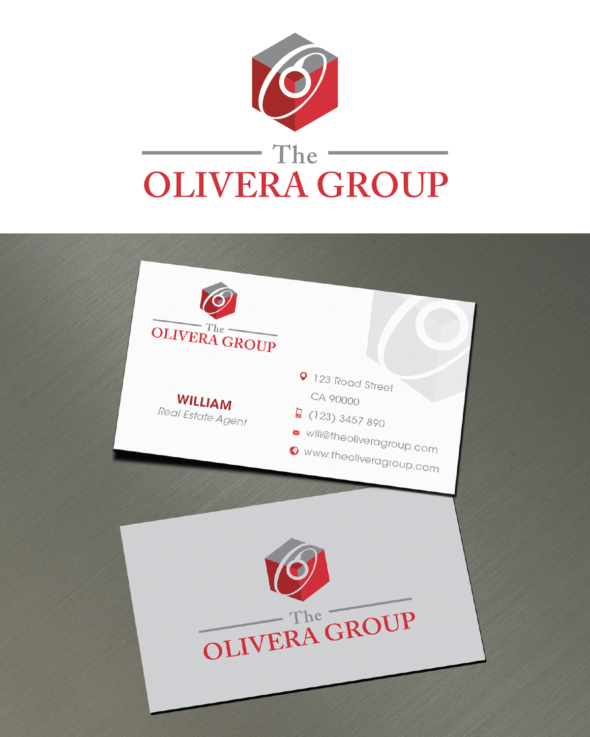
This customer received 201 logo designs from 47 designers. They chose this logo design from LutFi as the winning design.
Join for free Find Design Jobs- Guaranteed
-
 C$150
C$150
-
 201 designs
-
 47 designers
Logo Design Brief
The target audience would be for people in the city of Toronto between the ages of 25-55, both male and female with financial means to purchase real estate/land for personal use, investment or development. The Logo must communicate to our target audience a sense of "Professionalism" "Modern" Classic/timeless" design.
- colors to be used are- Red, Grey, Burgundy, White and (maybe blue???). Colors could all be used together, on their own or a combination of two or more. Open to Shades of Red and Greys and (Blues??). Font Style not exactly sure but we are looking for a more modern/classic/timeless FONT and STYLE. The BRAND is "The Olivera Group" but the "logo brand" is the Letter "O" The O must be the LOGO for "the Olivera Group". The "O" can be beside or on top of "The Olivera Group"
Ideas for the "O" could be in a "stamp" or "Seal" form
- The stamp or seal needs to have BODY/structure, not like the seal enclosed in the picture attached.
- The "O" could be modern like the picture attached. Divided in two and implemented in "Olivera" as well
Target Market(s)
General Audience male/female... working single or family or corporate client
Industry/Entity Type
Real Estate
Logo Text
The Olivera Group
Logo styles of interest
Wordmark Logo
Word or name based logo (text only)
Lettermark Logo
Acronym or letter based logo (text only)
Font styles to use
Colors
Colors selected by the customer to be used in the logo design:
Look and feel
Each slider illustrates characteristics of the customer's brand and the style your logo design should communicate.
Elegant
Bold
Playful
Serious
Traditional
Modern
Personable
Professional
Feminine
Masculine
Colorful
Conservative
Economical
Upmarket
Requirements
Must have
- The Olivera Group with the LETTER "O" being the logo
Nice to have
- Ideas for the "O" could be in a "stamp" or "Seal" form
- - The stamp or seal needs to have BODY/structure, not like the seal enclosed in the picture attached.
- - The "O" could be modern like the picture attached. Divided in two and implemented in "Olivera" as well
- Please see all pictures
Should not have
- PLEASE my fellow designers, no rooftops, buildings, homes or anything that directly involves real estate. Lets expand and be unique and creative. I really look forward in seeing all your designs