Upgrade Logo for Hardware Store
Want to win a job like this?
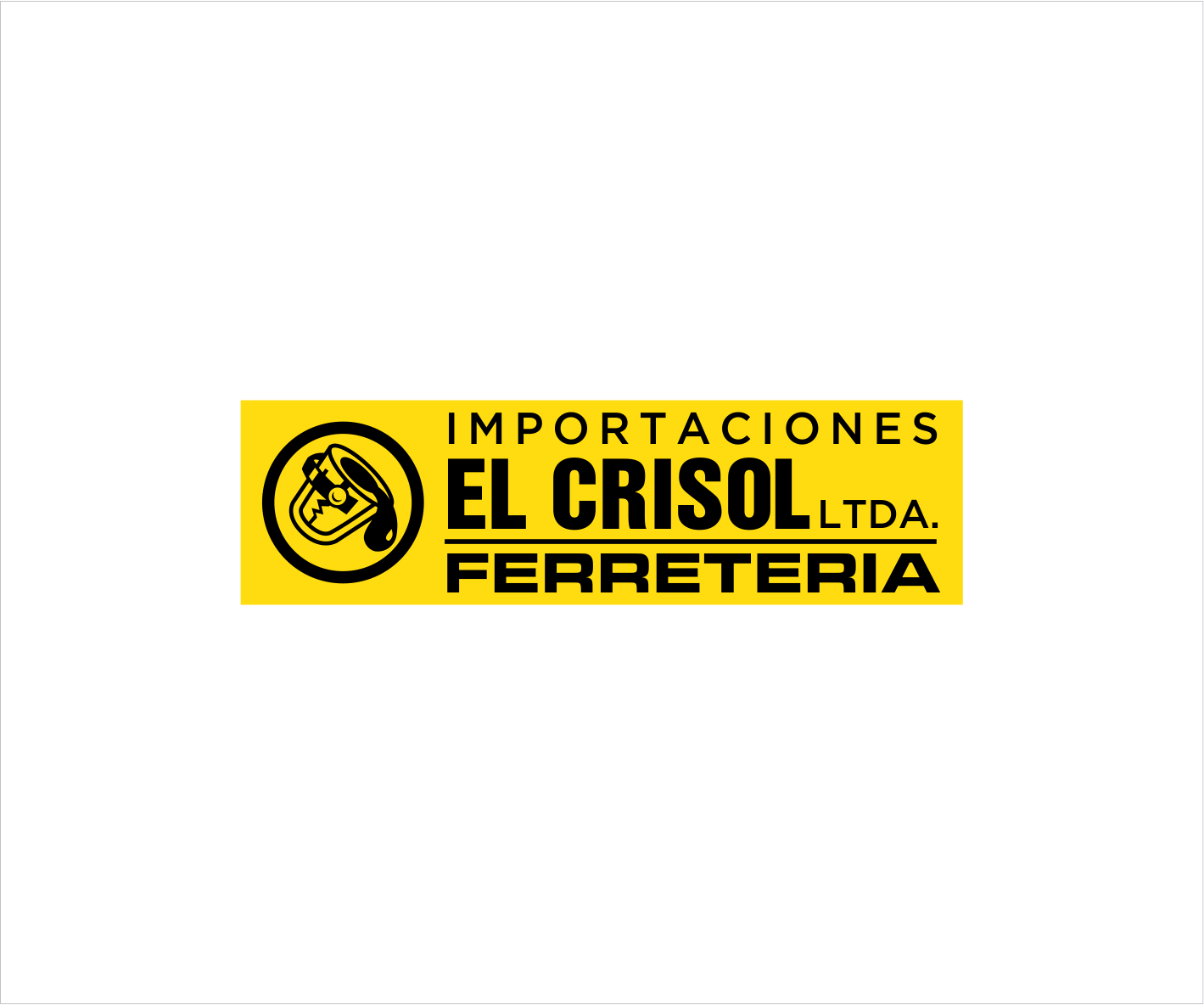
This customer received 6 logo designs from 4 designers. They chose this logo design from LNKstudio as the winning design.
Join for free Find Design Jobs-
 US$150
-
 6 designs
-
 4 designers
Logo Design Brief
We want to upgrade our logo since its been the same for more than 50 years.
Its a hardware store in Colombia and our logo has always been black and yellow which we like!
We dont want to make a drastic change as we want people to still recognize our brand as we've used the same image for long time now, so it has to seem an upgraded logo but with subtle changes.
"El Crisol" means "The Melting Pot" which is a pot in which iron is melted as u can see in the logo's icon... uve seen it on movies for sure ;)
Target Market(s)
We sell different kinds of hardware lines: Construction, Industrial Security, Electric Tools, Agriculture Tools, Cutting Tools, Precission Tools
Industry/Entity Type
Construction
Logo Text
Importaciones El Crisol Ltda. Ferreteria
Logo styles of interest
Pictorial/Combination Logo
A real-world object (optional text)
Character Logo
Logo with illustration or character
Wordmark Logo
Word or name based logo (text only)
Colors
Colors selected by the customer to be used in the logo design:
Look and feel
Each slider illustrates characteristics of the customer's brand and the style your logo design should communicate.
Elegant
Bold
Playful
Serious
Traditional
Modern
Personable
Professional
Feminine
Masculine
Colorful
Conservative
Economical
Upmarket
Requirements
Must have
- Im attaching the actual logo which is being used.
- The logo must have the complete name: Importaciones El Crisol Ltda. Ferreteria
- and graphic icon.
- Regarding FONTS, we could try different variations.
Nice to have
- keep it simple, less the better, clean