Real Estate Logo Update - Newer more modern version style and colors
Want to win a job like this?
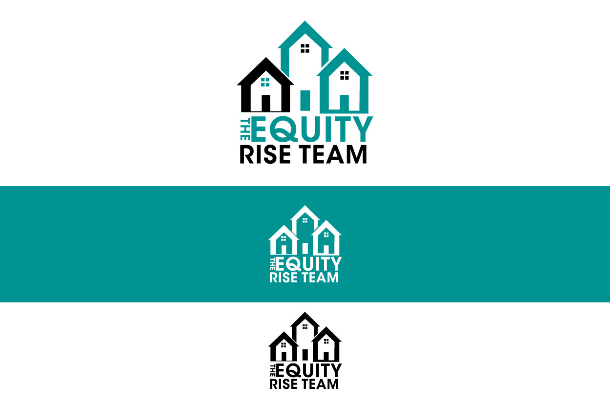
This customer received 245 logo designs from 73 designers. They chose this logo design from AXE Design as the winning design.
Join for free Find Design Jobs-
 US$150
-
 245 designs
-
 73 designers
Logo Design Brief
We are a real estate company with an existing logo that is old and needs to be updated.
The words "The Equity Rise Team" should be prominent. The words "Pearson Smith Realty" should be more of a subtitle.
The old logo is included. Your new logo design may reference the old one visually, or not. We'll consider both approaches.
The logo should be clean and businesslike. It may represent real estate visually, or just be an attractive version of the name. It should be simple enough to embroider on hats and polo shirts.
I have included two colors which belong to our franchise. Our new logo should look good on the same page as these two colors but does not necessarily need to use the exact same colors.
Target Market(s)
Real Estate
Industry/Entity Type
Realtor
Logo Text
The Equity Rise Team - Pearson Smith Realty
Logo styles of interest
Abstract Logo
Conceptual / symbolic (optional text)
Wordmark Logo
Word or name based logo (text only)
Look and feel
Each slider illustrates characteristics of the customer's brand and the style your logo design should communicate.
Elegant
Bold
Playful
Serious
Traditional
Modern
Personable
Professional
Feminine
Masculine
Colorful
Conservative
Economical
Upmarket
Requirements
Must have
- Deliver in a high resolution Photoshop file with layers.
Nice to have
- An additional vector file version would also be nice.