Software Company Logo Redesign
Want to win a job like this?
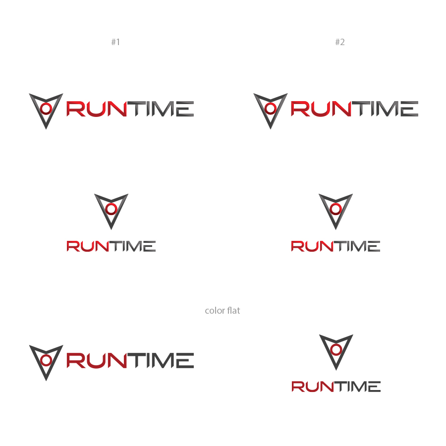
This customer received 188 logo designs from 72 designers. They chose this logo design from Brando ST as the winning design.
Join for free Find Design Jobs-
 US$160
-
 188 designs
-
 72 designers
Logo Design Brief
We are looking to redesign our company logo to a more modern look and feel while targeting a broader market audience.
We would like our logo to maintain the graphics on the left hand (upside down triangle and circle). This is a MUST. We are flexible with the colors in particular of the text.
Our company is an enterprise software company currently focused in the electronic design arena, however we are actively pursuing other adjacent markets.
We are removing Design Automation from our current logo attached below.
Updates
Project Deadline Extended
Reason: Extending the deadline to allow for revisions.
Added Saturday, November 12, 2016
Target Market(s)
Enterprise Software for High Performance Computing
Industry/Entity Type
Tech
Logo Text
Runtime
Font styles to use
Look and feel
Each slider illustrates characteristics of the customer's brand and the style your logo design should communicate.
Elegant
Bold
Playful
Serious
Traditional
Modern
Personable
Professional
Feminine
Masculine
Colorful
Conservative
Economical
Upmarket
Requirements
Must have
- Maintain the upside down triangle with circle on the left hand side.. Remove Design Automation from the logo.
Nice to have
- See Above Description
Should not have
- Words "Design Automation" as they are in the current logo