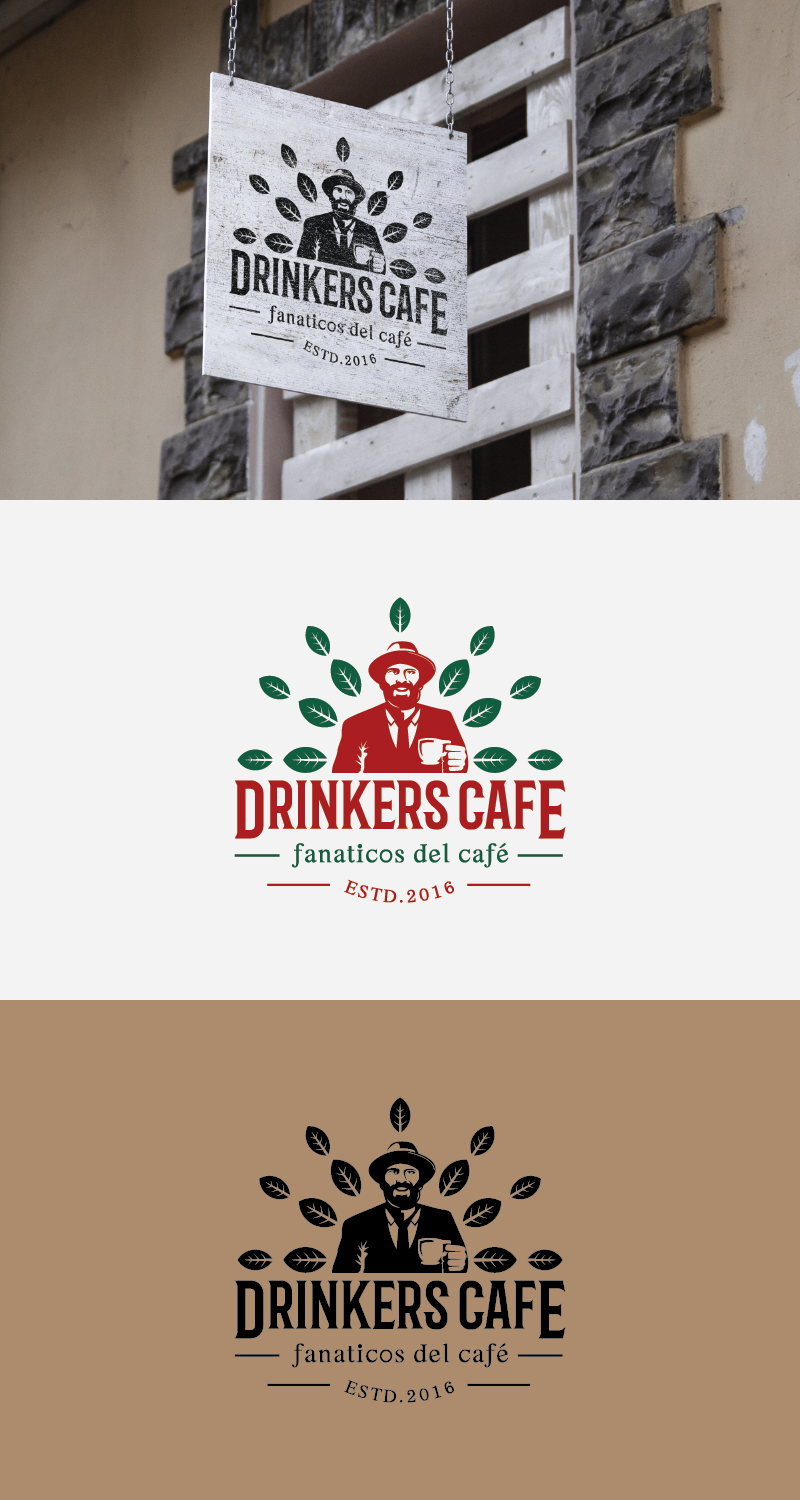
Logo and labell for a roasted coffee brand
Want to win a job like this?
This customer received 55 logo designs from 19 designers. They chose this logo design from eko07 as the winning design.
Join for free Find Design Jobs- Guaranteed
-
 US$160
-
 55 designs
-
 19 designers
Logo Design Brief
Logo and label illustration for a coffee brand called Drinkers Cafe.
Target to people 25 to 45 yrs, would like to show with the logo additional an illustration of one or two people that represents a Drinker "coffee drinker" because we all are coffee drinkers.
We have the slogan is for "coffee fanatics". Check www.drinkers.co to see our current development.
We produce coffee in colombia and our brand wants to be based on the consumer and not exactly the comodity which is the coffee, that is why our brand is called "Drinkers Cafe" for coffee fans.
Target Market(s)
Men and women 25 to 45 years old, x generation and milenials happy enjoy life and a good cup of the best coffee in the world
Industry/Entity Type
Cafe
Logo Text
Drinkers Cafe
Logo styles of interest
Emblem Logo
Logo enclosed in a shape
Pictorial/Combination Logo
A real-world object (optional text)
Character Logo
Logo with illustration or character
Wordmark Logo
Word or name based logo (text only)
Font styles to use
Other font styles liked:
- Helvetica
Look and feel
Each slider illustrates characteristics of the customer's brand and the style your logo design should communicate.
Elegant
Bold
Playful
Serious
Traditional
Modern
Personable
Professional
Feminine
Masculine
Colorful
Conservative
Economical
Upmarket
Requirements
Must have
- Easy to read, talk to coffee drinkers, it is about the consumer who loves coffee and the brand resembles best coffee to enjoy.
- It would be great to get a complete label with logo and picture or illustration of a coffee drinker or drinkers enjoying a cup of coffee and more or less looking right at you almost like inviting you to enjoy coffee our drinkers coffee as they are doing.
Nice to have
- Nice if includes a good logo, integrated with illustrations or pictures of coffee drinkers and more cool if when the image is placed in a label this has depth, it has to invite buyers to pick up the coffee bag from the shelve because it talks to them, coffee fanatics coffee lovers...
- And it has to communicate that it is coffee.
Should not have
- Should not be too basic or too complicated. Easy to read but cool.