Retro Sci-Fi Music Album logo to use as project name and on the album cover!
Want to win a job like this?
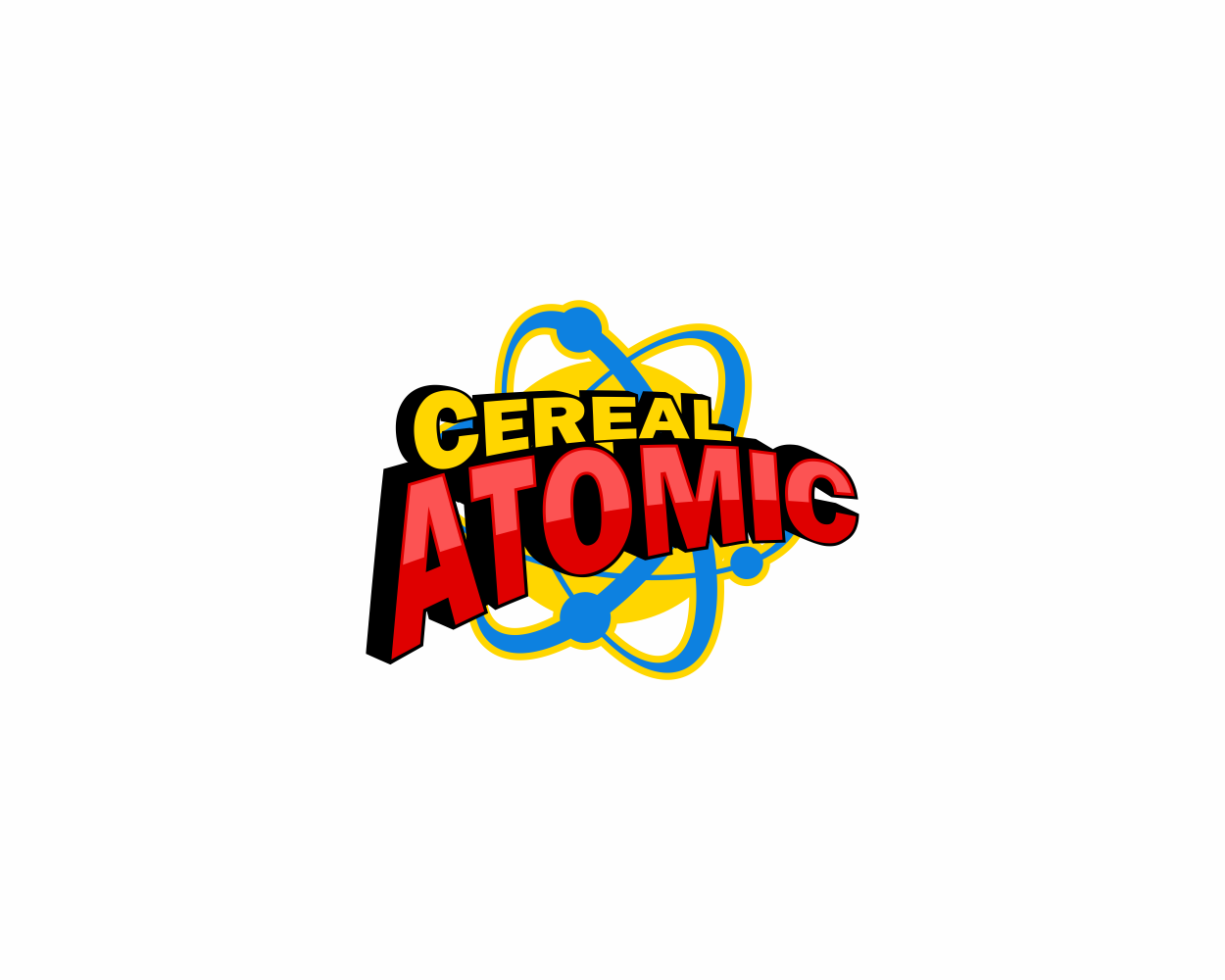
This customer received 80 logo designs from 17 designers. They chose this logo design from alpino as the winning design.
Join for free Find Design Jobs-
 US$310
-
 80 designs
-
 17 designers
Logo Design Brief
This lovingly crafted project plays up the FUN, RETRO aspect of looking at the future from the 1950's. Back then, there were wonderful, fanciful illustrations of life in the future that look dated now but still retro cool.
One of those icons was the symbol of the Atom, and I want to include that in the logo. One obvious place to use it is to replace the “o” in the word “atomic” with that atom symbol. Another would be to super it on top or behind the overall lettering (it's important that the word "atomic" is instantly readable).
Another cool idea is to place the wording at the top third of a breakfast cereal box, to play up the cereal name aspect. That would leave room for the subhead ("Tasty Sci-Fi in Every Byte!") inside a starburst. And could also be used to feature a sweet little alien kid who looks a lot like the classic TV character Mikey “He likes it!” Life cereal commercial. The kid on the box is one element too many for a logo, but it's something I'd like to have room to add later. If you do a cereal box, please do the box at a tilt, as in some of the included examples, with perspective that easily shows it’s a cereal box, not a flat 2D rectangle. I am not looking for an exact copy of the Wheaties logo typeface, just illustrating nice perspectives with their box titled various angles.
Another is to use the Wheaties or Superman lettering perspective style WITHOUT the box. Or to just go with your gut. Ultimately, I’m looking for something that is very appealing to Gen X and Baby Boomer guys (age 40 – 70) who love sci-fi and who will recognize these elements as being cool artifacts from their childhoods.
So go bold, masculine and FUN. It’s a concept that should look a little dated in a futuristic manner, as if it were being featured in Tomorrowland (at Disneyland) in the 1950’s. Please see the included art I’ve gathered for hints at directions I think are worth exploring.
And please note I'd like to include a SUBHEAD:
Tasty Sci-Fi in Every Byte!
That should be an element we can slip in and out.
Thanks!
Updates
I think this logo may do well as a comibook style design with superhero lettering like the Flash or Superman. Big perspective as the letters grow larger and pop out at you...
Added Saturday, August 20, 2016
Target Market(s)
Sci-Fi lovers, especially people over age 35.
Logo Text
Cereal Atomic
Look and feel
Each slider illustrates characteristics of the customer's brand and the style your logo design should communicate.
Elegant
Bold
Playful
Serious
Traditional
Modern
Personable
Professional
Feminine
Masculine
Colorful
Conservative
Economical
Upmarket
Requirements
Must have
- An additional, removable subhead:
- Tasty Sci-Fi in Every Byte!
Nice to have
- See Project Description
Should not have
- 80's "Tron"-style lettering