Non-Profit Healthcare Start-up Seeks Logo Design
Want to win a job like this?
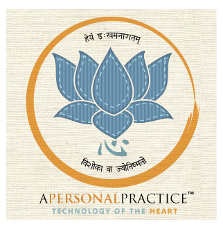
This customer received 57 logo designs from 12 designers. They chose this logo design from Coco Creative Design as the winning design.
Join for free Find Design Jobs- Guaranteed
-
 A$280
A$280
-
 57 designs
-
 12 designers
Logo Design Brief
We are a non-profit healthcare start-up that deals with primarily Yoga, but are expanding to offer other holistic disciplines (TCM etc) to the community.
We currently have a website which is undergoing some small changes, but ideally the logo would fit in with this design. It can be found at - http://www.apersonalpractice.org.
Logo wise there is no single symbol we currently use. The strength must revolve around the text 'A Personal Practice' primarily, however we would be open to seeing suggestions. Common ideas around Yoga often include the lotus flower etc., however would also like to see some thinking out the box and surprises.
Some influences and food for thought:
* I have always liked the look of handwritten fonts such as Handwriting Dakota (www.shoesofprey.com is a good example)
* I would love to incorporate an aspect of Japanese calligraphy (shodo) for style. Think Zen influence like the circle.
* Colourwise I am honestly seeking something using blacks, whites, baby blues and greys (gun metal etc) as a good guide. Nothing too bright or overwhelming.
* Additional websites for style ideas - http://blog.otoutoproject.org. (blog in the works). Also another yoga website www.healingyoga.org.
* TOMS shoes is one organisation that inspires.
Major inspiration for logos can be found attached. The final design should communicate simplicity and a sense of being minimalist, but with an idea of healing or cared about. Principles of the organisation are strength, stability, stillness and calm.
The power of the human touch...
Updates
I have added some more design inspiration in the brief outline.
Added Wednesday, November 16, 2011
I have added some more design inspiration in the brief outline.
Added Wednesday, November 16, 2011
Project Deadline Extended
Reason: Hi Guys,
I would like to firstly thank you all for the amazing designs submitted for my brief. There is a high standard of work which continues to impress.
I wanted to let you all know that due to a range of unforseen personal circumstances I have had to extend the final deadline by a small period of time. As my attention will be diverted elsewhere for a short while I felt like this was appropriate in order to allow time for me to return with fresh eyes and focus.
I encourage you to continue to submit designs or wait for my feedback. I will continue to be in direct contact with those who I feel are close to expressing what I would like to capture in this logo.
It has been a process I have thoroughly enjoyed so far working, and I would like to personally thank you for treating this work like it was your own.
Warm regards,
Sean
Added Wednesday, November 23, 2011
Target Market(s)
Everyone
Industry/Entity Type
Non-Profit
Logo Text
A Personal Practice
Logo styles of interest
Pictorial/Combination Logo
A real-world object (optional text)
Wordmark Logo
Word or name based logo (text only)
Look and feel
Each slider illustrates characteristics of the customer's brand and the style your logo design should communicate.