Adamsons Pharmacy
Want to win a job like this?
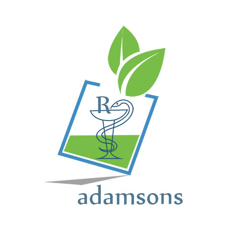
This customer received 46 logo designs from 24 designers. They chose this logo design from RameshM22 as the winning design.
Join for free Find Design Jobs- Guaranteed
-
 £150
£150
-
 46 designs
-
 24 designers
Logo Design Brief
We require a new logo for our client Adamsons Pharmacy in Ireland which was founded in 1820.
Adamsons is a family run single store pharmacy (now run by the Quinn family) located in a small friendly Irish town with majority of it's customers being well known locals. It places value on exceptional customer service and local community. The logo should reflect this/
The store operates a prescription counter as well as a retail area selling the usual health and beauty products including high-end make-up products e.g. Clarins etc.
The logo will be used for all corporate identity (except shop signage - see below). The logo will also be used on their new e-Commerce site and must act as link between the online store and the traditional physical store.
There is no colour stipulation for this project. The logo must also work well in a single colour for newspaper advertising, paper bag printing and uniform embroidery.
Updates
Thank you all for your submissions so far. However, please do read all of the brief before submitting. It states clearly that the design has to be sympathetic to the original shop front and MUST have the pharmacy (snake, cup and R) included in the logo.
Added Thursday, September 05, 2013
Thank you all for your hard work and input to this competition. I am now feeding all of your designs to my client for shortlisting and for any amendments that they may require.
Added Wednesday, September 11, 2013
Target Market(s)
The target market of the physical store would largely be anyone in the local small town community.
The new e-Commerce site however is geared towards:
- younger online generation
- more affluent individuals looking to buy high end beauty products
- age group estimated as 25-40, predominantly white female market
Industry/Entity Type
Pharmacy
Logo Text
Adamsons Pharmacy
Logo styles of interest
Pictorial/Combination Logo
A real-world object (optional text)
Wordmark Logo
Word or name based logo (text only)
Lettermark Logo
Acronym or letter based logo (text only)
Look and feel
Each slider illustrates characteristics of the customer's brand and the style your logo design should communicate.
Elegant
Bold
Playful
Serious
Traditional
Modern
Personable
Professional
Feminine
Masculine
Colorful
Conservative
Economical
Upmarket
Requirements
Must have
- The new logo must be sympathetic to the historic nature of the physical building however, it must also work on their new e-commerce site which will have a clean white background.
- Please keep in mind that the shop front (attached photograph) has been in place since 1820 and has to be retained as part of the town's planning regulations. The burgundy and gold shop signage is not being replaced.
- The logo must definitely include the "snake and cup Rx" pharmacy symbology as seen on their existing blue bag (attached photograph) however this can be redesigned/interpreted as you feel fit.