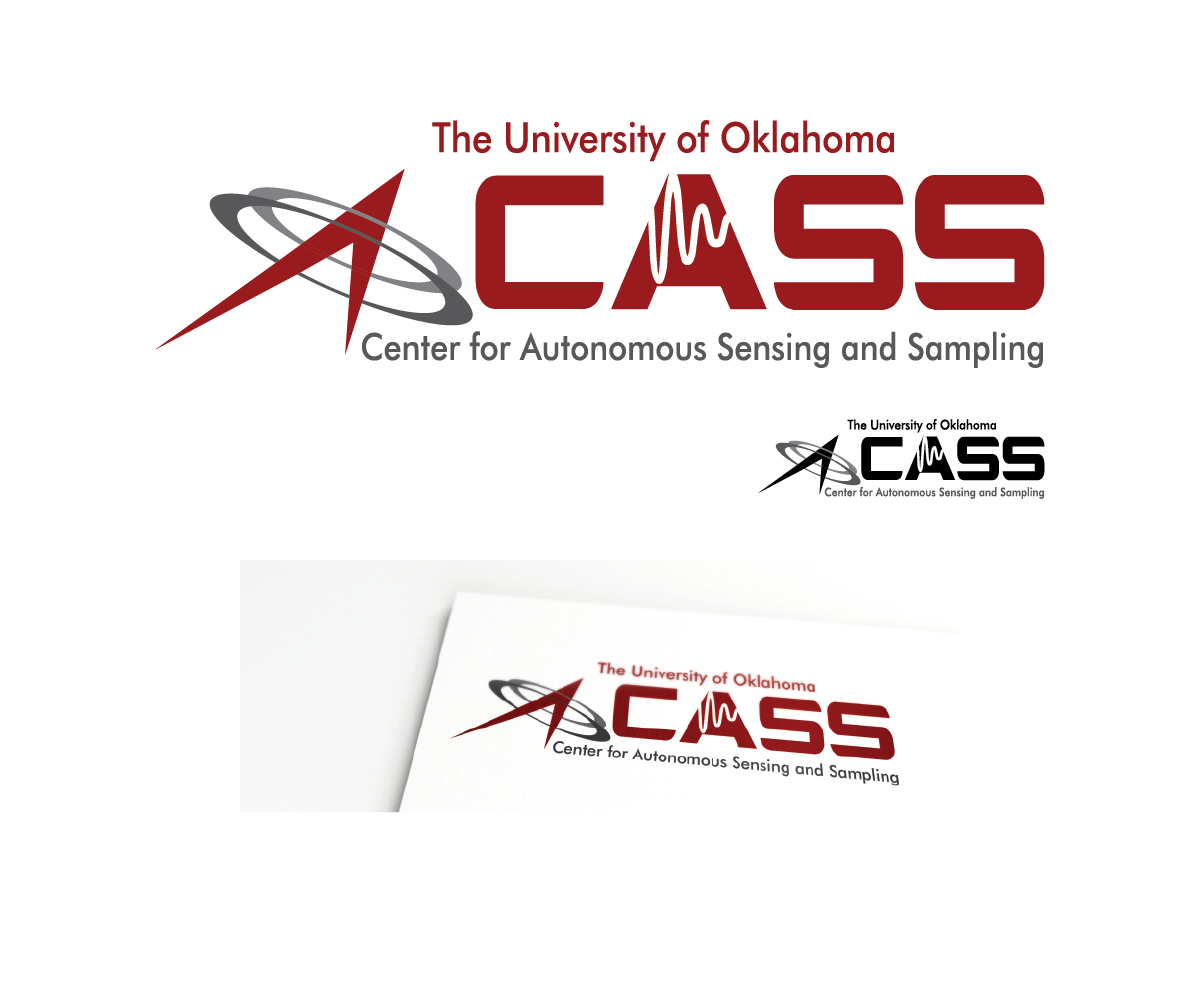
Center for Autonomous Sensing and Sampling (CASS)
Want to win a job like this?
This customer received 91 logo designs from 30 designers. They chose this logo design from The Captain as the winning design.
Join for free Find Design Jobs-
 US$160
-
 91 designs
-
 30 designers
Logo Design Brief
We need a logo for a university research center that highlights the acronym CASS. We would like the acronym highlighted (larger) and the actual name of the center in a smaller font. Our preferred colors are black and crimson (see attached). The general concept of the center is to use robotic and other platforms for environmental sensing (atmosphere, water, etc.). We are looking for a good "crisp" corporate/professional look and feel. We are not limited to "drones", but want to convey the technology focus of the center. Attached is a concept that we developed, but this is not necessarily the direction we are proscribing, we are looking for creative alternatives. However, the attached gives an idea of the color palette (red and black) of our university. Please use the color palette from the "OU" logo in the attachment.
Target Market(s)
University research community
Industry/Entity Type
University
Logo Text
CASS / Center for Autonomous Sensing and Sampling
Logo styles of interest
Lettermark Logo
Acronym or letter based logo (text only)
Font styles to use
Colors
Colors selected by the customer to be used in the logo design:
Look and feel
Each slider illustrates characteristics of the customer's brand and the style your logo design should communicate.
Elegant
Bold
Playful
Serious
Traditional
Modern
Personable
Professional
Feminine
Masculine
Colorful
Conservative
Economical
Upmarket
Requirements
Must have
- Colors must be consistent with our university colors (http://www.ou.edu)
Nice to have
- Balanced two color scheme (red and black). The acronym CASS should be very prominent with the smaller text spelling out the center name: "Center for Autonomous Sensing and Sampling", but smaller font and less prominent in the logo. We are looking for a "very professional"/corporate feel.
Should not have
- We don't want "gimmicky" artwork, but are looking for more a professional feel.