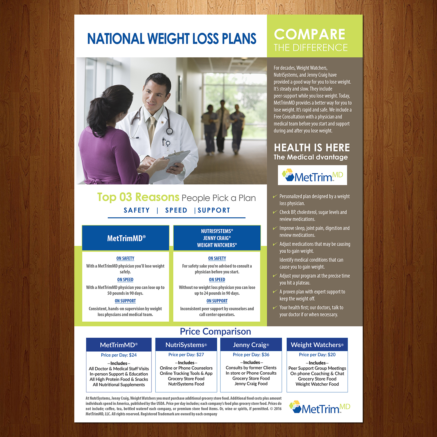
National Weight Loss Plans Comparisons
Want to win a job like this?
This customer received 40 flyer designs from 16 designers. They chose this flyer design from VEGA-Designs as the winning design.
Join for free Find Design Jobs-
 US$140
-
 40 designs
-
 16 designers
Flyer Design Brief
We are a medical weight loss, physician supervised, company. This one page, one sided 'national weight loss comparison information page' will be used by our clinicians to show patients the difference between our medical weight loss plan and a commercial weight loss plan. Use the colors in our LOGO where necessary. Go to www.MetTrimMD.com to see logo. But plz make sure that each section is distinct, but yet flows to the next section. There are 4 sections. See the Attachment. Section 1: Title; National Weight Loss Plans, the two paragraphs, Compare the difference. Section 2: Top 3 Reason People Pick a Plan. Section 3: Health Is Here. Section 4: Price Comparison. Note; the disclaimer at the bottom is by itself.
Target Market(s)
Weight Loss Patients. Consumers.
Industry/Entity Type
It Company
Look and feel
Each slider illustrates characteristics of the customer's brand and the style your logo design should communicate.
Elegant
Bold
Playful
Serious
Traditional
Modern
Personable
Professional
Feminine
Masculine
Colorful
Conservative
Economical
Upmarket
Requirements
Must have
- Be clear and make each section distinct, but at the same time try to make each section connect to the next. Should be professional. Use the colors in our logo at www.MetTrimMD.com. Use a font that would be appropriate for the consumer market.