HTML Web layout / data visualization for an information software application
Want to win a job like this?
This customer received 40 web designs from 8 designers. They chose this web design from DOA as the winning design.
Join for free Find Design Jobs- Guaranteed
-
 US$800
-
 40 designs
-
 8 designers
Web Design Brief
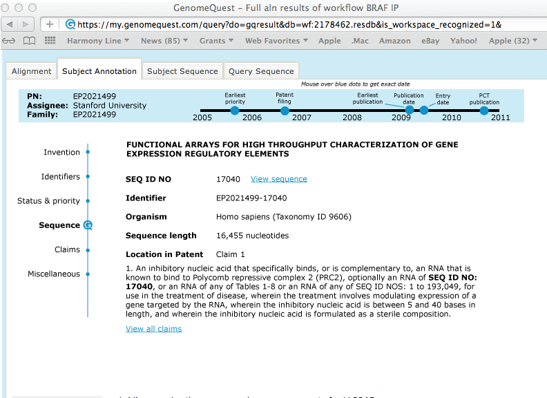
We have a product used by patent analysts to allow them examine information stored in patents - particularly those patents that include biological sequences like DNA, RNA, and protein.
When the user opens up a particular patent, they currently see a very poorly organized wall of text, presenting fields of data to them in unorganized ways. We have attached screenshots of the current interface.
The project is to redesign that layout so that the same information is presented in a way which is brings important data to the the eyes of the user, categorizes data appropriately, and is visually appealing. We have proposed logical categorizations of data in the document called "Fields documentation."
The deliverable should be an HTML5 file that renders one or more of the examples of records we've provided in your new design.
Description of files:
"Examples of records badly displayed": MS Word file that shows three different examples of the records we would like to better visualize.
"screengrab1.tiff" and "screengrab2.tiff": pictures of how these records sit inside of our product. This is presented to give you a sense of screen real estate, our look and feel, and colors. We do not want the whole screen redesigned - just the record display itself.
"Fields documentation": detailed documentation of what each field means. We have tried to group them logically for you, and have also attempted to inform you as to which fields are linked to others.
Updates
Hi all,
The project is to redesign that layout so that the same information is presented in a way which is brings important data to the the eyes of the user, categorizes data appropriately, and is visually appealing. We have proposed logical categorizations of data in the document called "Fields documentation."
Added Monday, August 26, 2013
Target Market(s)
Patent analysts, heavily educated scientists, Ph.Ds.
Industry/Entity Type
Software
Look and feel
Each slider illustrates characteristics of the customer's brand and the style your logo design should communicate.