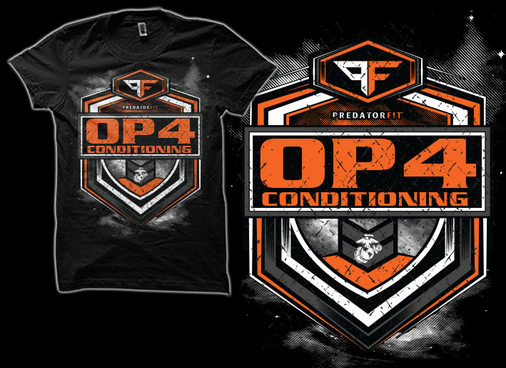
OP4 Conditioning Predator FIT TSHIRT
Want to win a job like this?
This customer received 43 t-shirt designs from 14 designers. They chose this t-shirt design from SIMRKS as the winning design.
Join for free Find Design Jobs- Guaranteed
-
 US$240
-
 43 designs
-
 14 designers
T-shirt Design Brief
This is a high intensity fitness program, developed by Combat US Marine Veterans. This is like crossfit. The name of the is Predator FIT - OP4 Conditioning . OP4 means (Opposition Force) Needs to have to be on a BLACK SHIRT with power colors like Orange/White, Red, Yellow.
Since the key word here is PREDATOR. You dont have to stay true to the official logo but the spirit should be there....Military meets crossfit.
Updates
All of you are doing great. Just so you know I am a somewhat of a graphic artist myself, please dont cut and paste clip art....Dont just use my logo only and or my text....Thanks mucho...Looking forward to some more great designs...
Added Wednesday, May 11, 2016
Target Market(s)
Fitness, Military, Hardcore individuals
Industry/Entity Type
Fitness
Font styles to use
Other font styles liked:
- Grunge Style Fonts
Colors
Colors selected by the customer to be used in the logo design:
Look and feel
Each slider illustrates characteristics of the customer's brand and the style your logo design should communicate.
Elegant
Bold
Playful
Serious
Traditional
Modern
Personable
Professional
Feminine
Masculine
Colorful
Conservative
Economical
Upmarket
Requirements
Must have
- Harley Davidson Style colors, and the logo style should have that style of feel as well as a military meets crossfit look.
- OP4 Conditioning should be the more dominating look and feel.I leave it up to the artisit to mix and match or change as they see fit...
Nice to have
- Leave it up to the designers. Im sure you have worked with Crossfit and Military before...
Should not have
- Not to much on the Predator Animals...