Marketing One Pager
Want to win a job like this?
This customer received 33 graphic designs from 12 designers. They chose this graphic design from raph as the winning design.
Join for free Find Design Jobs- Guaranteed
-
 US$140
-
 33 designs
-
 12 designers
Graphic Design Brief
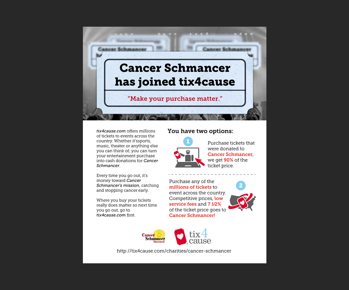
Our company, tix4cause is looking for a better design for a one page handout that our member charities can pass on to their donors and supporters explaining what tix4cause is and how they can use tix4cause to benefit the charity distributing the one pager.
Attached is the one pager we are currently using (see cancerschmancer),but we feel it needs to be much more visibly appealing so that the users will actually want to read it and take action. Please note that we are not specifically tied to each and every word. You have literary license to change words as long as the message remains in tact.
We want to provide this marketing tool to our charities so they can distribute both electronically and as physical handout.
Updates
Project Deadline Extended
Added Monday, August 05, 2013
Target Market(s)
People who support various charities. This is a piece that the charities will be giving to their supporters to try to convince them to use tix4cause.
Industry/Entity Type
Marketing
Look and feel
Each slider illustrates characteristics of the customer's brand and the style your logo design should communicate.
Elegant
Bold
Playful
Serious
Traditional
Modern
Personable
Professional
Feminine
Masculine
Colorful
Conservative
Economical
Upmarket
Requirements
Must have
- 1. The file needs to be in a version that we can manipulate (e.g. replace the logo of the charity with another charity logo) so we can use with all of our 650+ charity members.
2. Also the design needs to include tix4cause logo and a place for a charity logo.
3. Needs to contain the basic information on the attached file called cancerschmancer
Nice to have
- 1.Inviting images or graphically appealing lines/shapes that add to the overall look of the piece but still want it to look clean.
2. There is a lot of information we are trying to get across. We have tried to consolidate, but we feel if it is arranged more visually appealing the amount of the text won't be overbearing.
Should not have
- 1. It can't read as a fundraiser for a charity but more about how the supporter (everyday consumer) can re-direct their entertainment spend so that it makes a difference for a cause. More educating and fun then sales.
2. Can't have too much concentrated colored areas in case the charity wants to print these off as handouts which would be too costly from an ink perspective.