Black Fir Cannabis Farm the Highest quality humboldt county has to offer
Want to win a job like this?
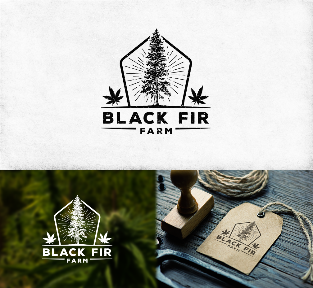
This customer received 34 logo designs from 16 designers. They chose this logo design from concoronco as the winning design.
Join for free Find Design Jobs-
 US$160
-
 34 designs
-
 16 designers
Logo Design Brief
we are a medical cannabis collective farm . Our main inspiration for this name is based off of the Douglas Fir , we recently endured massive fires (hence the black) . we would like to see a visual reference to cannabis in some of the designs but not all . some of the images can be exclusively a doug fir. we also like the idea of sketched black and white images with detail and some images that resemble a stamp like quality.
Target Market(s)
men and women age 21 to 45.
Industry/Entity Type
Agriculture
Logo Text
BLACK FIR FARMS
Logo styles of interest
Pictorial/Combination Logo
A real-world object (optional text)
Font styles to use
Colors
Colors selected by the customer to be used in the logo design:
Look and feel
Each slider illustrates characteristics of the customer's brand and the style your logo design should communicate.
Elegant
Bold
Playful
Serious
Traditional
Modern
Personable
Professional
Feminine
Masculine
Colorful
Conservative
Economical
Upmarket
Requirements
Must have
- Reference to Douglas Fir tree . Some cannabis leaf reference but not necessarily the focal point. BLACK FIR FARMS
Nice to have
- detailed line work , sketch like quality possible reference to the burnt trees or fire.
Should not have
- blocky basic outlines or silhouette lacking detail