iOS & Mac OS X icon redesign : Password Sync Symbol
Want to win a job like this?
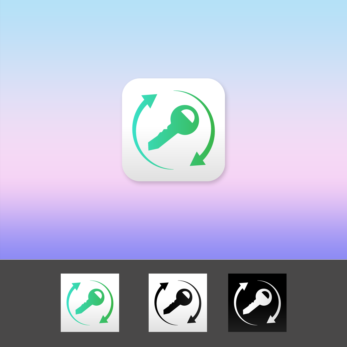
This customer received 83 logo designs from 21 designers. They chose this logo design from Leo SC as the winning design.
Join for free Find Design Jobs- Guaranteed
-
 US$200
-
 83 designs
-
 21 designers
Logo Design Brief
Password Sync is an iPhone and Mac app that syncs seamlessly passwords and other sensitive data across a user's devices. Basically, it does what Lastpass and 1Password do but using Apple's native technologies and with a minimalistic style. It also provides military grade encryption to make syncing safe for our users.
I'm in the process of designing a new version, Password Sync 2, exclusively made for devices running iOS 7 and OS X Mavericks (or more recent). Starting with my existing symbol (the "syncing key"), I'm looking for an updated symbology that will reflect Password Sync's new context. I've designed the original key and icons, not being a designer I'm looking for a little bit of input from people who know what they're doing.
*** Attachments ***
File 1 : Just a little showcase of iOS 7 aesthetic. For reference and inspiration.
File 2 : Current key symbol ("syncing key") vector for reference (that's what I'm looking for you to redesign; see note)
File 3 : Important: a visual brief of the project with our current icons and how your symbol will be used. «««
Good luck everyone! I'll be more than happy to answer your questions and give you prompt feedback :)
Note on the current symbol: Please be aware that this vector is Password Sync's intellectual property. Feel free to use the "syncing key" I provided as a starting ground, but if you do and you do not win the contest, be aware that you won't be able to sell your design on another site or re-use it in another project.
Updates
We're now giving you 12 days total to work on your propositions: while you're working on the icon, we're working on the software. Now that's team work!
Added Thursday, June 27, 2013
Hi everyone!
Added Monday, July 08, 2013
Industry/Entity Type
Property
Logo Text
Password Sync
Logo styles of interest
Emblem Logo
Logo enclosed in a shape
Pictorial/Combination Logo
A real-world object (optional text)
Look and feel
Each slider illustrates characteristics of the customer's brand and the style your logo design should communicate.
Elegant
Bold
Playful
Serious
Traditional
Modern
Personable
Professional
Feminine
Masculine
Colorful
Conservative
Economical
Upmarket
Requirements
Must have
- ** Preamble **
The core concept of the app revolve around syncing across different devices. Therefore, our app is actually an array of different apps that have different icons (because they run on different platforms [iOS or OS X] or because they have different functions [a standalone password generator or the main password wallet application]).
The new app icon must adopt this idea: we're looking for a symbol that will unify these apps. Basically, we need to redesign our current "syncing key" symbol.
** Minimum requirements **
Even though we are looking for a new symbol (the "syncing key"), we'd love to see it in context : your design should include at least a new iOS 7 style square icon (will be automatically rounded by the OS) and an OS X icon (the shape is up to you).
** File format **
The new symbol must be delivered in a vectorial format (an ai file for example).
iOS and OS X designs can be rasterized but must minimally be of size 1024x1024. Please note though that vectors are preferred.
Nice to have
- The main objective here is to update our "syncing key" symbol. The current representation of a key that represents the security of the app and it's main usage (aka a password manager) engraved with a syncing symbol (the two rounded arrows) representing the fact that the app syncs.
However, we are completely open to new symbology: if you think of a more intuitive way to represent the app's function or have any other suggestions, we'll be happy to review them.
Should not have
- We do not want to put any emphasis on the version. Indeed, even though this is a Password Sync 2 icon, please refrain from using the "2".
We're not very fond of the idea of text in the logo, but if you have to use any, please use an appropriate font.
Also: the concept must be in most part original. Please refrain from just repackaging a stock logo.