Apartment Complex in Southeastern US needs new signage & identity!
Want to win a job like this?
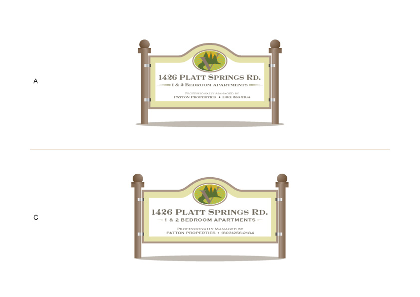
This customer received 65 signage designs from 10 designers. They chose this signage design from ~idiaz~ as the winning design.
Join for free Find Design Jobs- Guaranteed
-
 US$180
-
 65 designs
-
 10 designers
Signage Design Brief
Need a design for a physical sign/logo & signage for a 28 unit apartment complex in West Columbia, South Carolina, USA.
These are properties that, in their market , I would describe as "affordable." They are no-frills accommodations that are safe, clean and inexpensive.
The sign I want foremost is something that will be free-standing (not attached). Approximate measurements of the main finished sign should be about 4' x 6' (but really this is just an aspect ratio of course.)
Ideally also want to have smaller signs of a coordinated design created to denote the building number (maybe even on each door), but that is a secondary task. You'll get an idea for how ugly the current numbering and signage looks in some of the attached photos. Some of the photos also came from the old Facebook page of the prior management company. (This project could also possibly expand into creating new assets for taking over and rebranding that facebook page.)
The apartments are currently called "Lyngate Properties" but frankly speaking I despise this name and want to change (rebrand) it. As the new owner I am thinking to change the name:
Sign should basically say something like the following...
Verde Apartments
1 & 2 Bedroom Units
1426 Platt Springs Rd.
Professionally Managed by
Patton Properties: (XXX)XXX-XXXX
"Managed by" part should be detachable. For instance if I ever need to change management companies, I'd just want to be able to swap out that part of the sign, not the whole thing, of course.
Another consideration is that it would be good if there could be a "units available" or "move-in-special" part that could be attached to the top based on the property's status.
I think that earth colors are favorable and nice looking for what this is and where it is located.... greens/browns/tans/greys, etc.
Many similar signs I've seen online and in person have an this Equal Housing Opportunity logo on it (one of the example signs in the attached images appears this way). I may want to have that appear on the sign -- I'm not yet decided.
I'm attaching some logos of similar signs, as well as some photos of the property itself. You can probably also find more information and photos (Google Street View.)
I can answer any question or inquiry you might have in pretty short time.
Target Market(s)
- Low-Mid income singles & families in the Southeast US looking for safe & affordable housing
Industry/Entity Type
Apartment
Look and feel
Each slider illustrates characteristics of the customer's brand and the style your logo design should communicate.
Elegant
Bold
Playful
Serious
Traditional
Modern
Personable
Professional
Feminine
Masculine
Colorful
Conservative
Economical
Upmarket
Requirements
Must have
- - A design proposal for an outdoor sign
- - Design for sign should have some 'detachable' parts for the management company, and to indicate whether units are available and
Nice to have
- - "Earthy" colors: tans/browns/greens etc. seem like it might be nice. (The region, [US postal code 29169] has lots and lots of pine trees.)
Should not have
- No comic sans! :)