Portfolio 360 for iPad
Want to win a job like this?
This customer received 19 app designs from 10 designers. They chose this app design from nicholas as the winning design.
Join for free Find Design Jobs-
 US$830
-
 19 designs
-
 10 designers
App Design Brief
We are looking to design a page for the mobile app. The app is intended for financial professionals and is based on a successful desktop application. The existing design will serve as a very rough guideline, but we are open to hearing ideas.
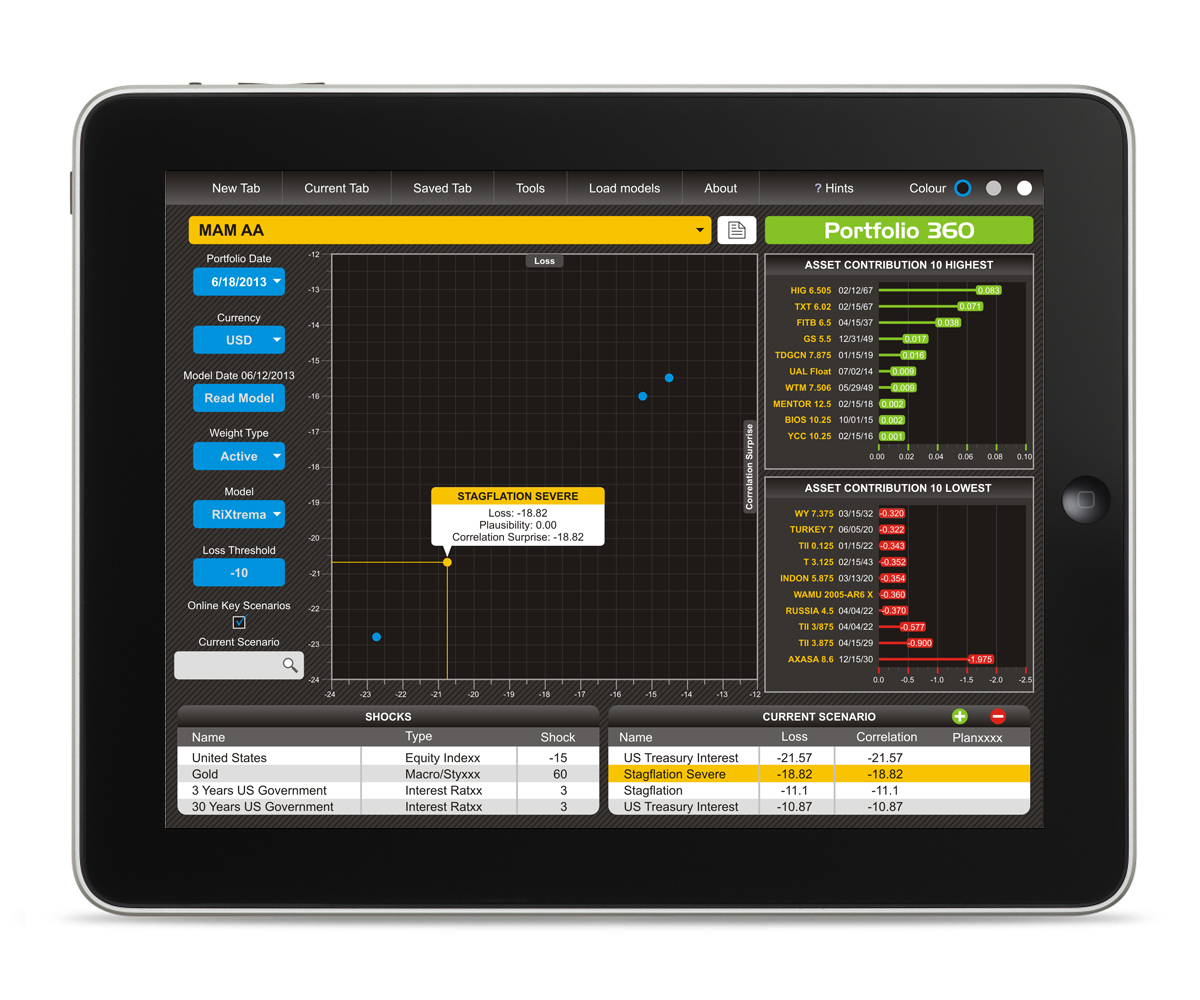
Uploaded file #1 contains a screenshot of the existing design. The workflow is as follows:
The user picks a portfolio from the Dropdown below portfolio.
The user picks a Loss Threshold, which will dictate what gets onto the bubble chart below.
Once the bubble on the chart is clicked, a text box pops up with the description of the particular crisis that the bubble represents.
Once the bubble is clicked, the right hand side bar charts are populated with moves relevant to this scenario.
The left hand pane contains two text boxes. The lower one is particularly important, because the user is able to remove scenarios or add scenarios (screen #2). Removing scenarios is simple.
Adding scenarios brings up a wizard (screen #3). It also needs to be designed consistently with the front page of the app. The wizard has different clickable categories going down the column on the left and in a row on the top. The user can pick some or all of these categories.
Notes: The app should be designed for landscape mode only. The key to keep in mind is how the user will select bubbles on the chart. Right now, it is quite easy, but with the touchscreen it may be more complicated, so please keep that in mind when designing the chart (it should still be some version of the similar chart).
*As a first pass, please submit your idea of the concept (layout/colors/buttons) without the detailed design. We will choose 1-3 concepts and then the detailed work will take place with a much higher chance of a payout.
Updates
Thank you for the first two sketches. The second one by nicholas appears to be a bit more mobile app oriented, though we are still considering both and waiting for other submissions. One request, could you rework the sketches to include a bit more of dark blue as a background? \
Added Thursday, June 20, 2013
Industry/Entity Type
Financial
Look and feel
Each slider illustrates characteristics of the customer's brand and the style your logo design should communicate.
Elegant
Bold
Playful
Serious
Traditional
Modern
Personable
Professional
Feminine
Masculine
Colorful
Conservative
Economical
Upmarket
Requirements
Must have
- The general outline for the bubble chart must be retained. But the actual execution may differ significantly. We are open to seeing different ideas.
The winning design will also get a contract to design the rest of the application (2 more screens), which will be worth the same as the original design.