LADY MARMALADE. LOGO DESIGN
Want to win a job like this?
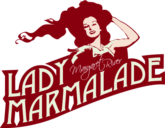
This customer received 109 logo designs from 24 designers. They chose this logo design from Daniel Lopez Denham as the winning design.
Join for free Find Design Jobs- Guaranteed
-
 A$200
A$200
-
 109 designs
-
 24 designers
Logo Design Brief
Lady Marmalade is a new business in Margaret River Western Australia, a region known for its gourmet produce and fine wines.
We produce cakes, jams, preserves and we specialise in traditional christmas cakes, pies, puddings and shortbreads.
We also cater for events such as ladies high teas.
We offer a specialty cake service for birthdays and celebrations.
We are looking for a logo we can use on product labels, and also on letterhead, sample menus, signage etc.
We are interested in having a retro/vintage feel to our logo.
We are thinking of a vintage burnt orange and cream 1950s colour palate, with burgundy or crimson as an accent colour if it works.
We are also thinking of having 'Lady Marmalade ' as a character as part of the logo. Both of the ladies who run the business are striking redheads!
For inspiration think the lady on Nurses Cornflour box, Redheads matches. A 1950's housewife feel...google vintage packaging images for inspiration
We are attracted to 'old school' advertising fonts, in particular 1950's print advertising fonts, but we are not limited to this.
We also want the words "Margaret River" in the logo, but not as prominent as the words "Lady Marmalade"
Much of our customer base is an older, conservative crowd and we endeavour to please them as well as ourselves. Therefore, whilst we want something retro and a bit funky, it needs to be the right approach so as to attract new custom, but not frighten away the older generation!
We are pretty keen on all of the above but if you have a great concept that differs a bit don't hesitate to pitch it.
Updates
Hello designers!
Just a quick point based on designs so far. We were originally thinking that the lady marmalade character be a smaller element of the logo, or perhaps a face alongside the writing.
The colour palatte of burgundy, cream, burnt orange etc is still relevant and if you decide to use fruit symbols, then oranges are good, but in particular segmented oranges and in particular, blood oranges due to their great colour.
If anyone has a logo without the lady character, that will be considered also.
thankyou!
Added Tuesday, August 09, 2011
Industry/Entity Type
Conservative
Logo Text
Lady Marmalade Margaret River
Logo styles of interest
Emblem Logo
Logo enclosed in a shape
Character Logo
Logo with illustration or character
Wordmark Logo
Word or name based logo (text only)
Look and feel
Each slider illustrates characteristics of the customer's brand and the style your logo design should communicate.