Logotype for a proffessional dance couple
Want to win a job like this?
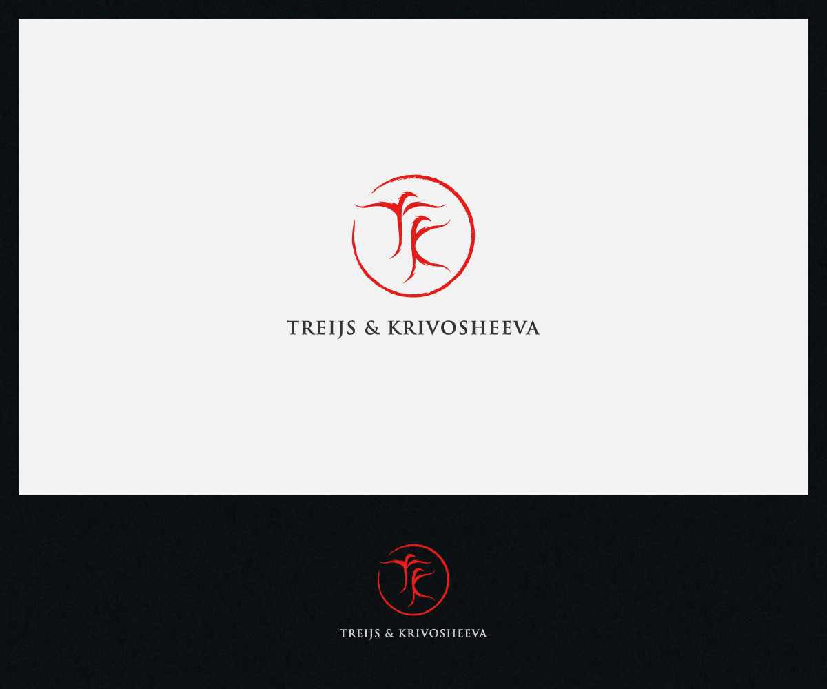
This customer received 53 art designs from 12 designers. They chose this art design from Roy as the winning design.
Join for free Find Design Jobs- Guaranteed
-
 €140
€140
-
 53 designs
-
 12 designers
Art Design Brief
Our names are:
Karlis Treijs & Anastasiia Krivosheeva
Some information and inspiration you can find on our Facebook page:
https://www.facebook.com/karlisnastja
I thought it would be nice to use letters ''K'', and ''T'' in some combination. Feel free to be creative.
My feeling is that I want something simple and elegant, few lines, I would like to see curves and delicate endings of letters.
Updates
Project Deadline Extended
Reason: When I choose the final design, I want to work out all of the details which concerns me. And I feel that this working week looks like to be to a little bit too short for this task.
Added Wednesday, September 23, 2015
Target Market(s)
People around the globe in age 30 and above. I will have many clients in Los Angeles. And large percentage of them will be originated from Asia. So I think dragon theme could be nice.
Industry/Entity Type
Dance Studio
Font styles to use
Look and feel
Each slider illustrates characteristics of the customer's brand and the style your logo design should communicate.
Elegant
Bold
Playful
Serious
Traditional
Modern
Personable
Professional
Feminine
Masculine
Colorful
Conservative
Economical
Upmarket
Requirements
Must have
- Option 1 - described in project description.
- Option 2 - you can use letters "A", "K" standing for (Karlis & Anastasiia)
- Option 3 - you can use brief and light lines of a dancing couple combined with "T", "K"
- Option 4 - just random symbol standing for elegance, movement, dance etc.
Nice to have
- Dragon symbol combined in the design, number 8 combined in the design.
- Red color
Should not have
- Very difficult idea.
- A lot of lines.
- Too bold letters.
- A lot of sharp corners.