IT Business needs services diagrams turned into infographics
Want to win a job like this?
This customer received 15 infographic designs from 5 designers. They chose this infographic design from lovelyMe as the winning design.
Join for free Find Design Jobs-
 A$230
A$230
-
 15 designs
-
 5 designers
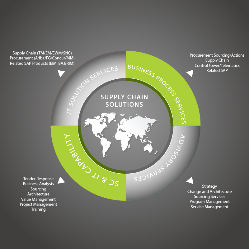
Infographic Design Brief
We have two diagrams that show our service categories. We'd like the content to be turned into an infographic for each diagram so that they look more modern and professional. The two infographics should have a similar design so that they can be used together. The infographics should use the content supplied in the diagrams and the corporate colours of black, grey and green as per our website www.fourpl.com.au. Attached below is the original diagrams and some infographic designs that we are currently using but we would like something new.
Target Market(s)
Big Corporate companies
Industry/Entity Type
It Company
Font styles to use
Colors
Colors selected by the customer to be used in the logo design:
Look and feel
Each slider illustrates characteristics of the customer's brand and the style your logo design should communicate.
Elegant
Bold
Playful
Serious
Traditional
Modern
Personable
Professional
Feminine
Masculine
Colorful
Conservative
Economical
Upmarket
Requirements
Must have
- Content as per the diagrams
- Use corporate colours of green, grey and black
Nice to have
- Similar style to the website style: www.fourpl.com.au
- strong lines, modern style.
Should not have
- nothing airy fairy,