Organically based professional Haircare line needs a New Look!
Want to win a job like this?
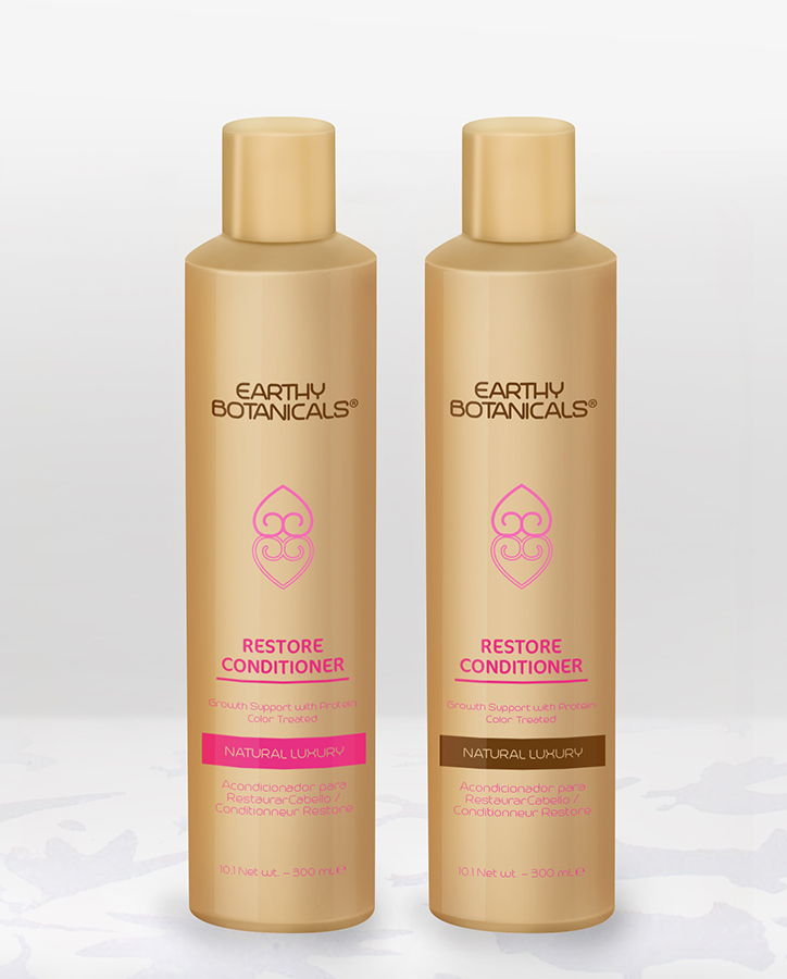
This customer received 21 packaging designs from 4 designers. They chose this packaging design from Soluciones Creativas as the winning design.
Join for free Find Design Jobs-
 US$160
-
 21 designs
-
 4 designers
Packaging Design Brief
We are an organically based hair product line. We are looking for a simpler, cleaner look than what we have. Our Trademarked brand Earthly Botanicals is all about performance in the "green" environment. Right now, we are ONLY looking for ideas on what the bottle could look like. the HDPE-soft touch bottle is a custom color so no PMS match up but think "kraft paper" or "cardboard box" or simply Tan color. I have attached several docs. 1 of bottle print area, 1 of symbol to be used, 1 of similar bottle layout, 1 or several fonts we like so far but are not attached to. NOTE : Only ONE idea, per font needs to be submitted. We are looking for some IDEAS that will better position our Brand. this initial phase is for 12 pc product line in 1 size to be SCREEN printed in 2 color, possible 3, also, each product has a PMS associated with that particular product. For this instance, PMS # 286 can be used. The symbol attached we would like to have mirrored effect with PMS attached to that product, in this case #286.Be aware that we have 3 different sizes PER product so this project is for ALL our graphic work Now and Future.
Target Market(s)
Consumers that visit professional hair salons
Industry/Entity Type
Hair
Font styles to use
Other font styles liked:
- sent in upload
Look and feel
Each slider illustrates characteristics of the customer's brand and the style your logo design should communicate.
Elegant
Bold
Playful
Serious
Traditional
Modern
Personable
Professional
Feminine
Masculine
Colorful
Conservative
Economical
Upmarket
Requirements
Must have
- an overall inviting feeling. think Simple, Clean, Honest. We are not just looking for a designer for this particular project alone, we would like to form a working relationship with someone that can do ALL our graphics work now and in the future.
- kind regards
- danny
Should not have
- the file labeled J1, this is to simply get a feel for the direction we would like to go in. Brand name on top (1 color we are initially think dk brown, dk choc brown...give us an idea), maybe some blank space with symbol(attached) in centered mirrored format with inside drawing(see J1 lotus pic) same but same PMS as the rest of the copy to include the name of the product, description and what will be on the back.