Design my brand - Soul & Co - project marketing & property investment services
Want to win a job like this?
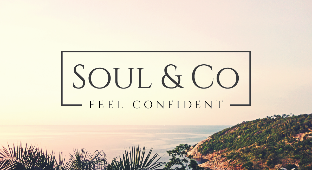
This customer received 99 logo designs from 37 designers. They chose this logo design from Andrew as the winning design.
Join for free Find Design Jobs-
 A$160
A$160
-
 99 designs
-
 37 designers
Logo Design Brief
I would like someone to design a simple logo for me. Think Tiffany & Co, Qantas, Apple, Kookai. It should either be simple black or a very dark grey that can use colours like purple, turquoise as a complimentary coloru palette. It may have a line at the top and bottom. It will also look great as reverse block in images. A simple classy brand that is expensive but worth it. It is for my project marketing business which will sell new residential developments. It is a confident, smart brand that is respected in the market place. I provide project marketing services for developers whether it is their first time or a seasoned company looking for a different approach.
Target Market(s)
Small to large scale property developers - most demonstration a solid respected reputation in the market
Industry/Entity Type
Real Estate Development
Logo Text
Soul & Co
Logo styles of interest
Wordmark Logo
Word or name based logo (text only)
Font styles to use
Colors
Colors selected by the customer to be used in the logo design:
Look and feel
Each slider illustrates characteristics of the customer's brand and the style your logo design should communicate.
Elegant
Bold
Playful
Serious
Traditional
Modern
Personable
Professional
Feminine
Masculine
Colorful
Conservative
Economical
Upmarket
Requirements
Must have
- Tiffany & Co or similar type font, perhaps with a line above and below or just below.
- An 'out of the box' alternative
- First project marketing firm led by a female - add that feminine touch
- Strong, striking & confident - exudes smart, strategic and confident operator
- 2 options - just Soul & Co, then an expanded version...Soul & Co. Confident. Smart. Strategic (underneath)
Nice to have
- how this can be used against images in reverse block
Should not have
- Gimmicky or cheap feel
- something that is easily copied - avoid red and green