Software Application page - product section
Want to win a job like this?
This customer received 54 app designs from 3 designers. They chose this app design from SmartAppsART as the winning design.
Join for free Find Design Jobs- Guaranteed
-
 £120
£120
-
 54 designs
-
 3 designers
App Design Brief
I have developed a proposal generation application and want to improve the main user interface page.
This is the most important and most used page within my application and therefore it needs to look slick, clean, simple and easy to understand whilst looking very professional, creditable and established.
This is the page in which the user makes certain selections of products and the system will in turn display information on the product selected. The user can then add the product to the basket and the system also calculates the monthly cost of the product along with the profit the user makes by offering the particular product.
I have put something together myself and uploaded accordingly to give you an idea as to what it currently looks like and the structure that it needs to follow.
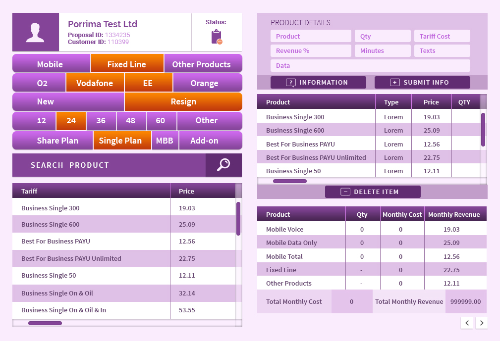
Section 1
This displays the Customer's account, proposal ID, Customer name etc
Section 2
I have these as radio buttons that the user selects, then clicks on the 'Search product' button. The items will then be displayed in section 3
Section 3
This datagrid displays the available products based on the section 2's selections
Section 4
shows information on the product that has been highlighed in section 3's datagrid. The user then clicks in qty field to enter the qty and then clicks the ADD shopping basket button to add the product to the basket in section 5 datagrid.
Section 5
This is the datagrid/shopping basket that displays all the products that the user has added.
Section 6
Displays all the figures including the total qtys', costs, revenue etc
WHILST IT IS IMPORTANT THAT THE DESIGN MUST FOLLOW THE STRUCTURE OF WHAT IS ATTACHED. I MUST POINT OUT THAT I AM NOT HAPPY WITH THE CURRENT DESIGN. I DO NOT LIKE THE LOOK AND FEEL OF THE CURRENT DESIGN AS IT LOOKS CHEAP AND AMATEURISH.
THE RADIO BUTTONS IN SECTION 1 FOR EXAMPLE SHOULD BE MORE CREATIVE, THE SIZE OF EACH SECTIONS CURRENTLY LOOK DISPROPORTIONATE. THE COLOURS ARE ALL OVER THE PLACE.
THE SIZE OF PAGE MUST BE 1009 X 689
PLEASE VISIT OUT OUR WEBSITE TO STICK TO THE COMPANIES BRAND: www.porrima.co.uk
I have other pages within my application that require designs along with icons and a lot of work on the website also require redesigning so the best design will also be given this work
Many thanks
Daniel
Industry/Entity Type
Software
Look and feel
Each slider illustrates characteristics of the customer's brand and the style your logo design should communicate.