Logo Design for Wedding Photographer

Winner
Contest winning design

Want to win a job like this?

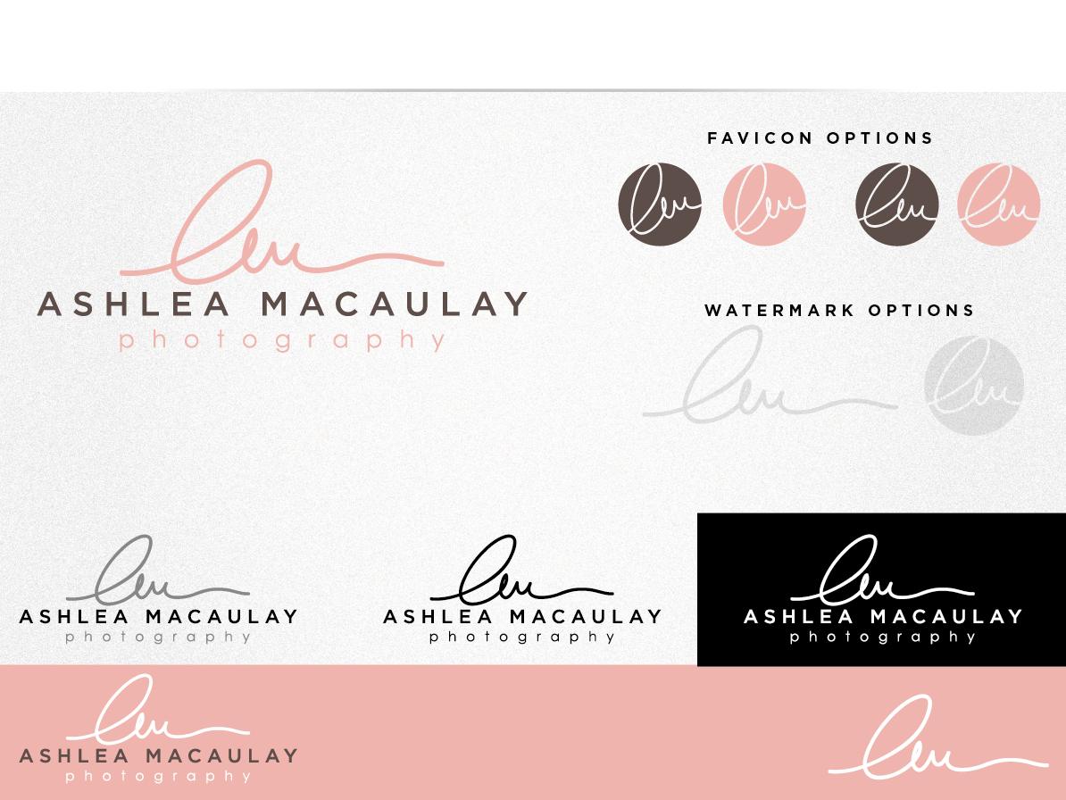
This customer received 118 logo designs from 37 designers. They chose this logo design from Cherry Pop Design as the winning design.

Join for free Find Design Jobs

  • Closed - Design Selected
  • Guaranteed

Logo Design Brief

Wedding and Lifestyle photographer specializing in capturing real moments through a journalistic approach. Looking for a clean logo that is easy to identify to be used across marketing materials and watermarking of images.
Prefer a balanced layout in proportion, not just a long rectangular line of text – which is what I currently have – 2 fonts stacked together. Also, not a fan of either of these fonts used in my current logo. www.ashleaphotography.com
Feel free to use lower case for 'photography' or my name if that works well in your design.

Things to consider in the design reflected in the feel I am looking for - personable, elegant, something that marries traditional and modern; not pretentious and not masculine.

Color story inspiration for new site design can be found here:
http://www.prettylittleinspirations.com/2011/09/color-inspiration-9172011.html

An option to include a bit of color but that also translates well to gray scale (also effective without color), and scalable. Some design element outside of text included is OK.

Please no camera or aperture images/icons.

Info Icon
Updates

Hello!

Thank you for the design submissions.
I have decided to include some links to logos that I like below. I am really looking for something feminine, modern and elegant.  Please review the brief where I have included colours and inspiration as well as things to avoid, like masculine touches and camera icons.

Here are som logo I like:
http://www.gabriellemarksphotography.com/
I like the first and last initial in a clean and modern script. This adds some more dimension and texture rather than just stacked text. 

http://www.sarahduckworthphotography.com/#

http://raquellealblog.com/

http://www.taniskatie.com/ Again, initials are used to add some dimension, but can also be used alone to watermark or as a favicon.

http://glowphoto.ca/blog/

http://www.google.ca/imgres?start=451&hl=en&sa=X&biw=1401&bih=807&tbm=isch&tbnid=lJPjKaT9wzERdM:&imgrefurl=http://www.nicoleconnerphotography.com/tag/wenatchee-studio-photographer/&docid=-Vch_Ukj5HV0_M&imgurl=http://www.nicoleconnerphotography.com/wp-content/uploads/p3/images/logo_1311671585.png&w=950&h=350&ei=ezNYUdaxC4fuyQGt94CIBA&zoom=1&ved=1t:3588,r:63,s:400,i:193&iact=rc&dur=934&page=21&tbnh=136&tbnw=370&ndsp=23&tx=157&ty=39


Added Sunday, March 31, 2013

Thanks for all of your submissions to date!

I am really excited about a few of the designs. I will be eliminating designs that don't seem like a compatible fit after rounds of changes as to not waste anyone's time.

I want to place emphasis on a few key design notes that are of importance:
-design should not be masculine
-my initials incorporated into design, used in a script like font, or hand drawn, 'fluid and clean'. 
Hoping to use initials for brand elements such as a favicon as well
-I've included a link in the brief to a colour palette I am using for my new web design. Feel free to pull from that or keep it please grey scale.
-no rainbow of colours, camera icons, or apertures. Nothing too cute or juvenile.
-keywords - simple, personable, elegant, feminine

Thanks! 

Ashlea


Added Thursday, April 04, 2013

Target Market(s)

About my clients: 90% of my bookings come from females between the ages of 20-35 Personality and brand image are very important to them

Industry/Entity Type

Marketing

Logo Text

Ashlea MacAulay Photography


Logo styles of interest
Abstract Logo

Conceptual / symbolic (optional text)

Wordmark Logo

Word or name based logo (text only)

Lettermark Logo

Acronym or letter based logo (text only)


Look and feel

Each slider illustrates characteristics of the customer's brand and the style your logo design should communicate.

Elegant
Bold
Playful
Serious
Traditional
Modern
Personable
Professional
Feminine
Masculine
Colorful
Conservative
Economical
Upmarket

Requirements
Nice to have
  • Favicon to match brand logo would be nice to include as well.
Should not have
  • Nothing too cute, ex no camera images or silly icons.
Payments
1st place
US$200
Participation payments x 3
US$20
Total
US$260

Project Deadline
09 Apr 2013 15:41:27 UTC
Language

Logo Design inspiration
Bid on my logo design, Cricket club logo design, Mascot logo generator design, Dj logo design, Hindi font logo, Open source logo design, Arabic logo design software, Negative space logo generator, Minimalist logo generator design, Logo auction