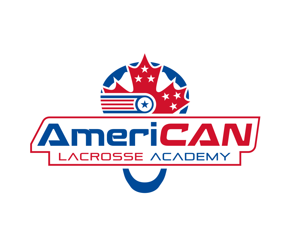
AmeriCAN Lacrosse Academy Logo- Lacrosse education company that needs a cool logo
Want to win a job like this?
This customer received 64 logo designs from 13 designers. They chose this logo design from nreimer as the winning design.
Join for free Find Design Jobs- Guaranteed
-
 US$260
-
 64 designs
-
 13 designers
Logo Design Brief
Would like a classy, clean, crisp logo that utilizes the concept of a combination of both American (USA FLAG) and Canadian (Maple Leaf or FLAG) styles of lacrosse. Red, white and Navy blue or just Red and Navy Blue would be great. Name is written "AmeriCAN" and would like the "Ameri" to be navy blue and the "CAN" to be RED. I feel like the "CAN" portion of the word should be italicized or "leaning' in some way to make it stand out within the name. "Lacrosse Academy" beneath the word with the logo above "AmeriCAN" or to the side. I really like the idea of a "crest" or "shield that combines elements of the American Flag and Maple Leaf/ or Canadian Flag. If the designer wants to use a lacrosse stick I am OK with that but it's unnecessary....Could also try a circular logo like the "Burlington Football Club" logo if that is a fit. When someone hears the name "American" they won't hear or see the "CAN" concept but it's an important element of this business....the Canadian skills we teach are critical to the product and are an important part of this business concept....When someone looks at the logo I want them to say...ahhhhh....."CAN" is for Canada or Canadian....clever....."
SEE LOGO FILES ATTACHED: I like all of them but the fonts are a little too "round" and "friendly"....not crisp enough...feel free to use those designs as a start as all are decent but not really "crisp and sharp" enough...would also like "Lacrosse" and "Academy" to be in contrasting colors and in opposition to the words above them like the one called "AmericanLaxAcadlogo"...
Target Market(s)
Boys Lacrosse Players and their parents
Industry/Entity Type
Education
Logo Text
AmeriCAN Lacrosse Academy
Logo styles of interest
Emblem Logo
Logo enclosed in a shape
Font styles to use
Other font styles liked:
- Copperplate Gothic Bold, Bank Gothic, Stencil
Colors
Colors selected by the customer to be used in the logo design:
Look and feel
Each slider illustrates characteristics of the customer's brand and the style your logo design should communicate.
Elegant
Bold
Playful
Serious
Traditional
Modern
Personable
Professional
Feminine
Masculine
Colorful
Conservative
Economical
Upmarket
Requirements
Must have
- Logo must have the name "AmeriCAN" with the words "Lacrosse Academy" beneath it and smaller....must have a crest or a symbol which represents both a USA theme (stars and stripes) and a Canadian theme (Maple Leaf, Canadian Flag) to the side or above the word "American"
- SEE LOGO FILES ATTACHED: I like all of them but the fonts are a little too "round" and "friendly"....not crisp enough...feel free to use those designs as a start as all are decent but not really "crisp and sharp" enough...would also like "Lacrosse" and "Academy" to be in contrasting colors and in opposition to the words above them like the one called "AmericanLaxAcadlogo"...
Nice to have
- Not sure if there is a way to make the crest from the "head of a lacrosse stick", but not an issue either way...just a thought....
Should not have
- Not sure there are any limits....looking for clean, crisp, sharp, classy