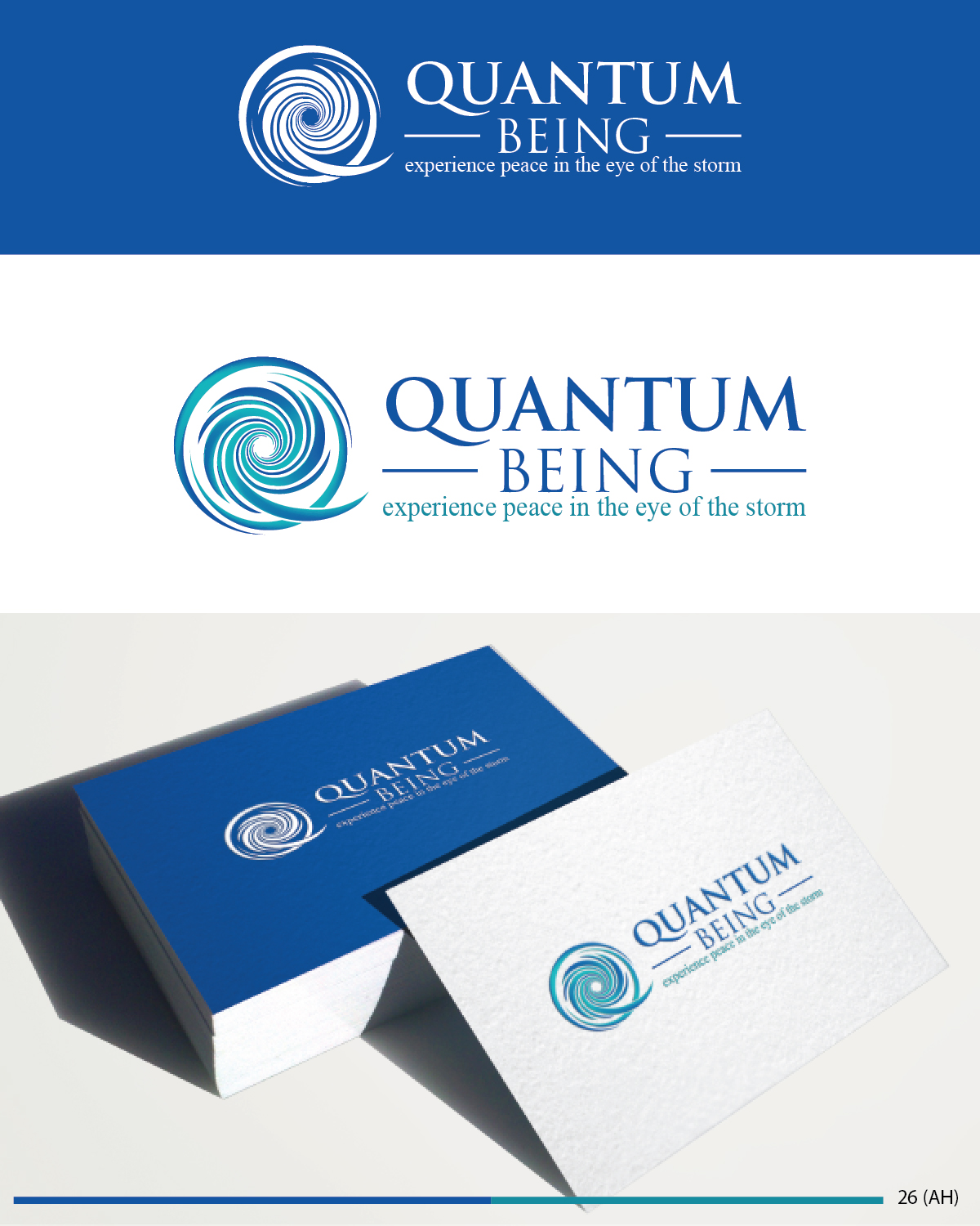
Quantum Being is a logo for both a website and for online products
Want to win a job like this?
This customer received 52 logo designs from 7 designers. They chose this logo design from Esolbiz as the winning design.
Join for free Find Design Jobs-
 €120
€120
-
 52 designs
-
 7 designers
Logo Design Brief
Quantum Being is more than personal development... it is a total transformation of one's own resonant energy field. It is a means of updating our thinking and feeling from the industrial age to the quantum age. I would like the Q in Quantum to resemble the colours and shape of the enclosed clockwise shaped vortex.
The subtitle "experience peace in the eye of the storm" to be in lower case, underneath QUANTUM BEING (in capitals)
Updates
Project Deadline Extended
Reason: I just need a bit more time to get feedback!
Added Friday, May 1, 2015
Target Market(s)
30-55 year old. People who are keen to expand their sense of being spiritually. It is all about experiencing one's own vibratory field of pure energy.
Industry/Entity Type
Online
Logo Text
Quantum Being: experience peace in the eye of the storm
Font styles to use
Colors
Colors selected by the customer to be used in the logo design:
Look and feel
Each slider illustrates characteristics of the customer's brand and the style your logo design should communicate.
Elegant
Bold
Playful
Serious
Traditional
Modern
Personable
Professional
Feminine
Masculine
Colorful
Conservative
Economical
Upmarket
Requirements
Must have
- Flare, imagination, +ve energy, inspiration
Nice to have
- http://www.ted.com/talks/jedidah_isler_how_i_fell_in_love_with_quasars_blazars_and_our_incredible_universe#t-164029
- Take a look at this Ted Talk... midway this lady explains what a quasar looks like.... it may help you feel the energy I'm trying to capture. Why, because this same structure is what makes up the cells of our body. I'll add a couple of photos I captured from this video.