Bad Ass Branding for famous charity
Want to win a job like this?
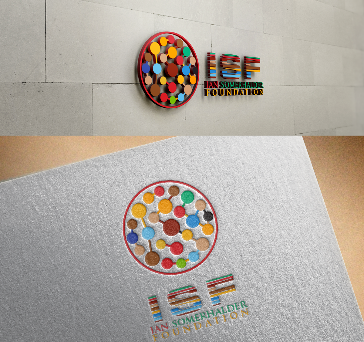
This customer received 24 graphic designs from 5 designers. They chose this graphic design from soulucifer as the winning design.
Join for free Find Design Jobs-
 C$200
C$200
-
 24 designs
-
 5 designers
Graphic Design Brief
We are looking for a logo that represents what we believe in- that all things are connected, they link, one into another. we are not looking for typical kumbyaya charity logos, we need moderen, clean and impactful - so that when one looks at it they "Get" the inteconnected interlinked concept immediately
the files below are shapes and ideas we love, with the littleness one being a fav. we need to place themes inside the logo in the form of clean modern icon looking shapes that represent some of our causes animals, eco, energy, youth development, biofuel, food health
Target Market(s)
Global
Industry/Entity Type
Charity
Font styles to use
Look and feel
Each slider illustrates characteristics of the customer's brand and the style your logo design should communicate.
Elegant
Bold
Playful
Serious
Traditional
Modern
Personable
Professional
Feminine
Masculine
Colorful
Conservative
Economical
Upmarket
Requirements
Must have
- logo must express interconnection, that all aspects are interlinked and requires eachother to exist. We focus on the Environment and its creatures so themes of bio fuel, clean energy, forestry, animal kindness, healthy soil/food, youth development ( through identifying their passions and talents- their fire) logo must be comprised of spheres or dots or shapes that can have clean, modern icon like images of these above said themes ie: clean energy : wind mill, animal kindness : dog and hand . We have icon samples we like and can easily send them for your reference
Nice to have
- ISF is our short formed name, representing the Ian Somerhalder Foundation
- Logo needs not be too busy conisdering we will have avried icon like images within it. Colour scheme is open, but prefer deep reds( brown, cherry, indian reds) and bright blues, and oranges) we are not into green- it's totally overued within the eco org industry. we are not looking for typical, we are looking for something that represents how DIVERSE we are in focus.. that the whole world functions by linking into each area of focus and that we cannot solve these problems by looking at them individually but rather who they intersect to each other.
Should not have
- we like clean fonts....